
NEO FOODS
YEAR / 2023
Brand Overview:
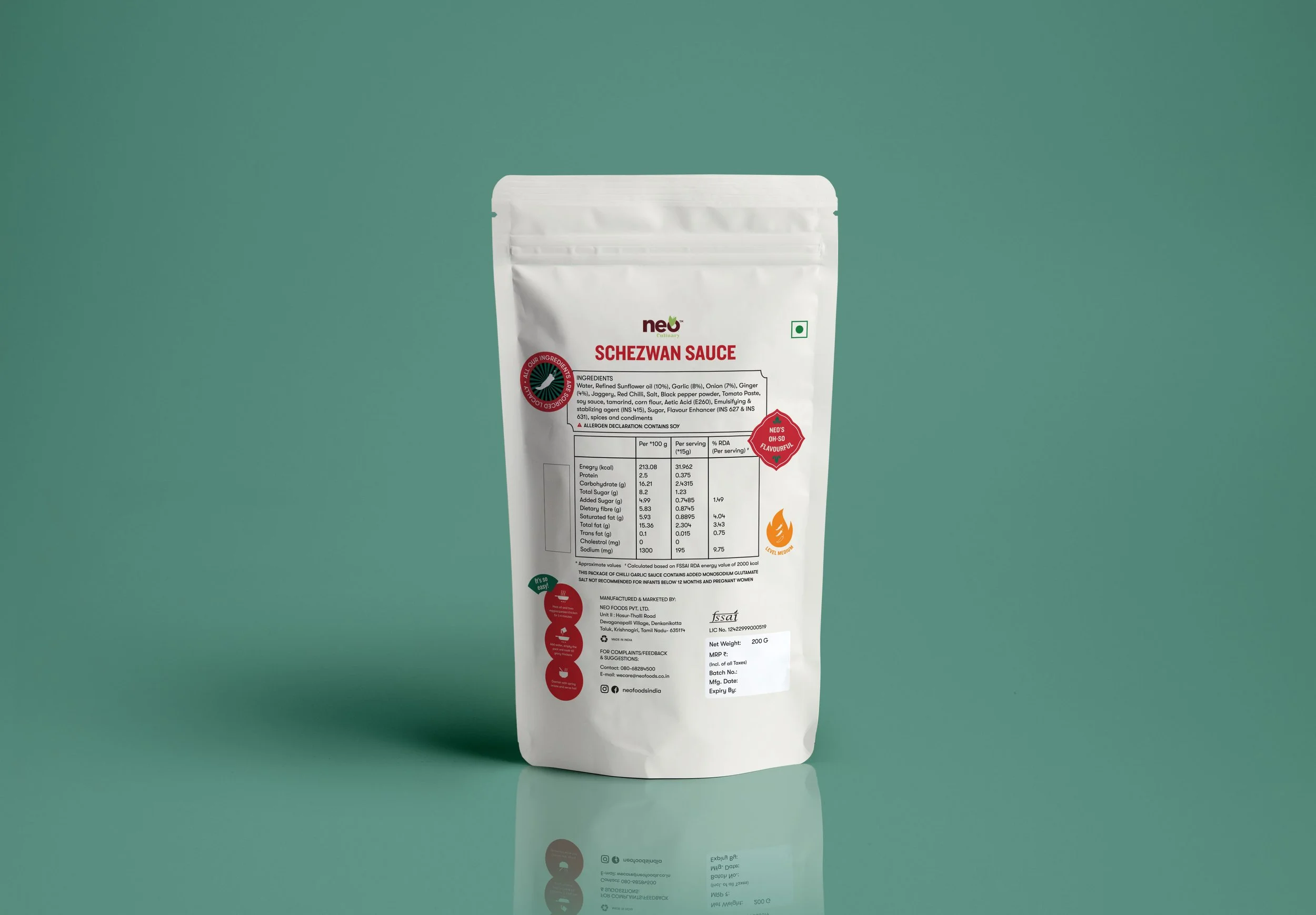
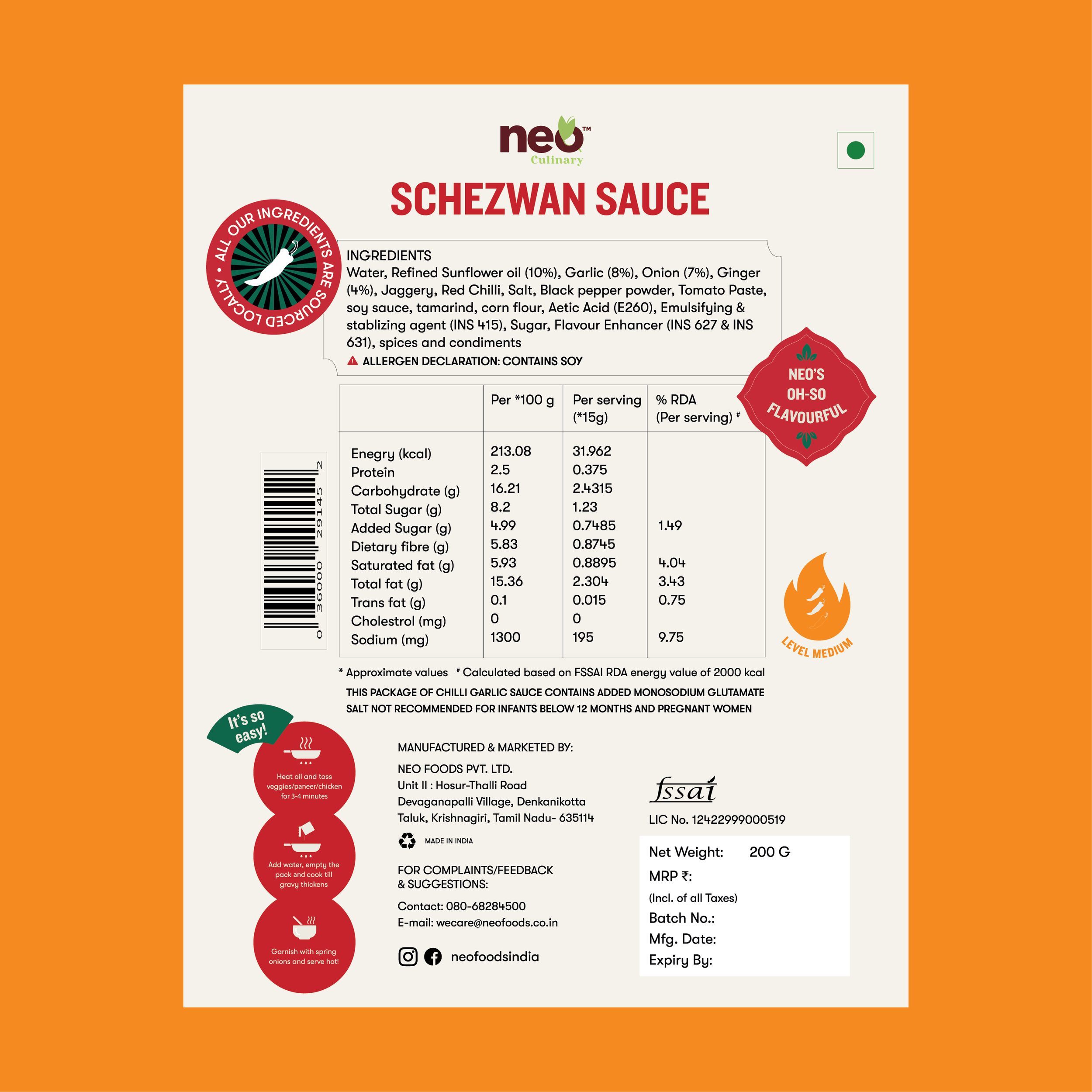
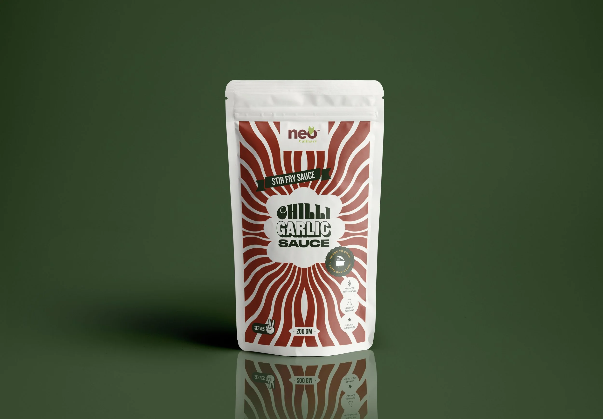
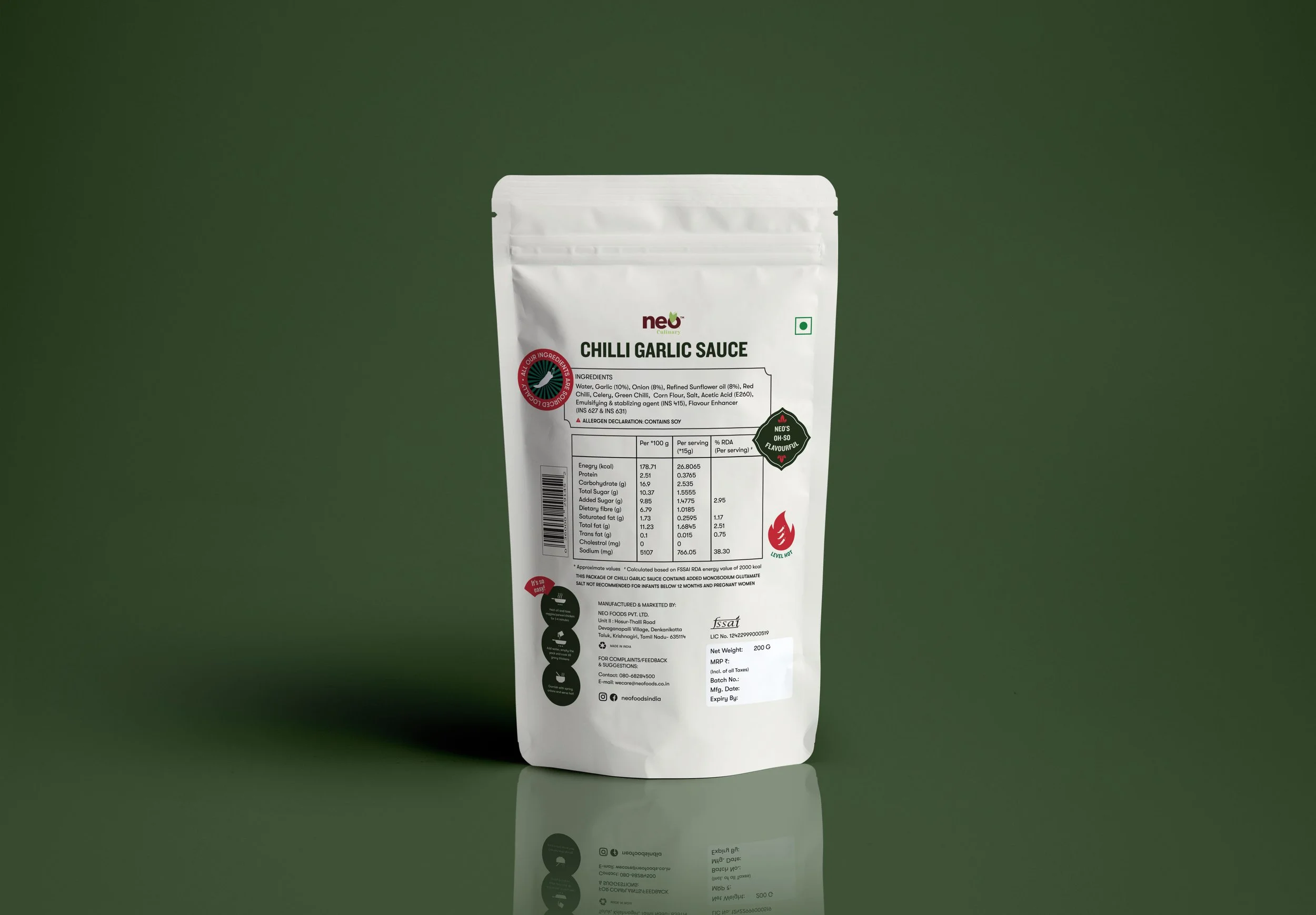
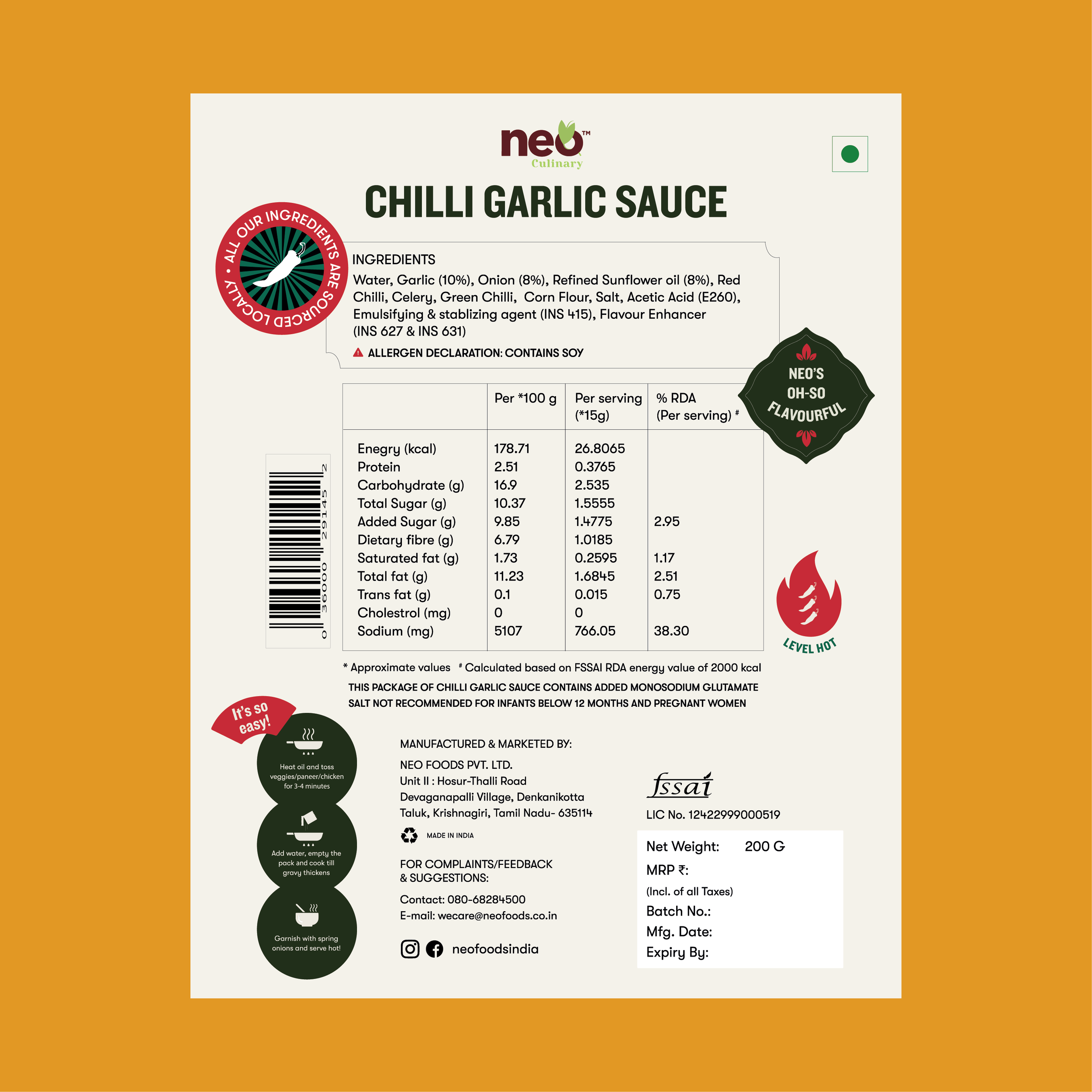
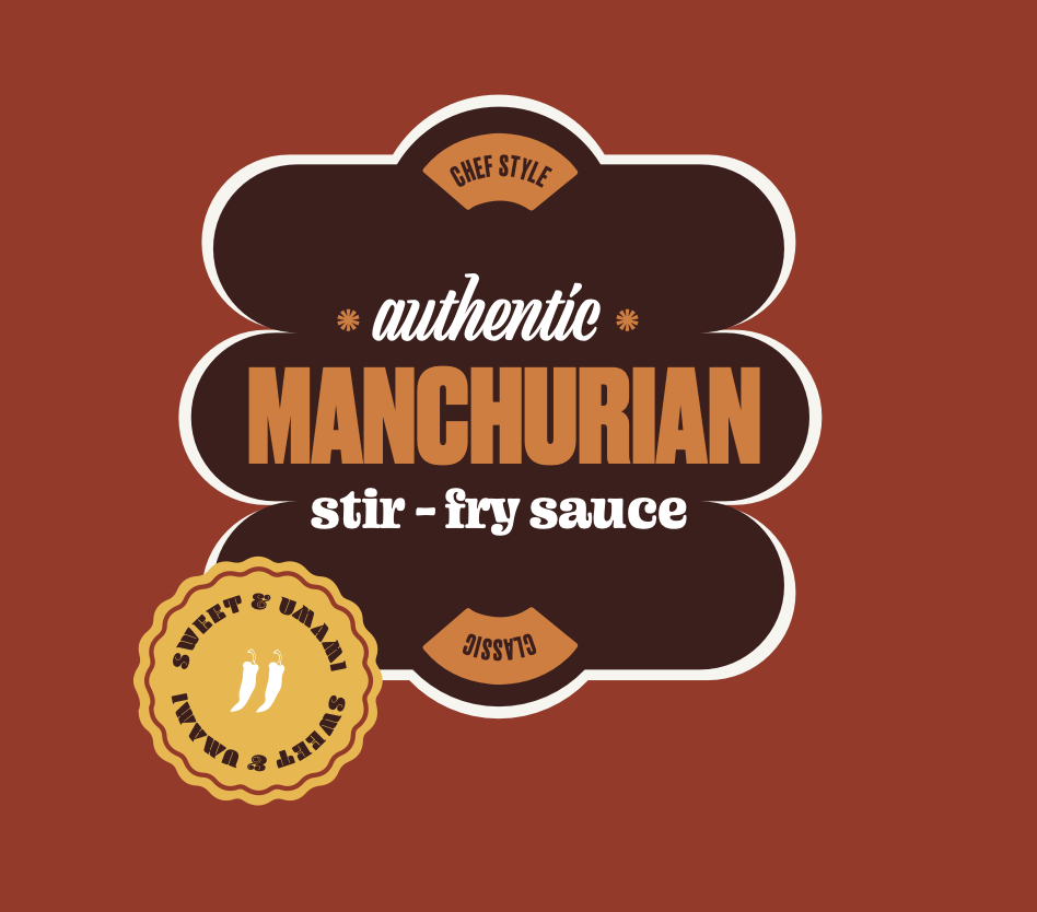
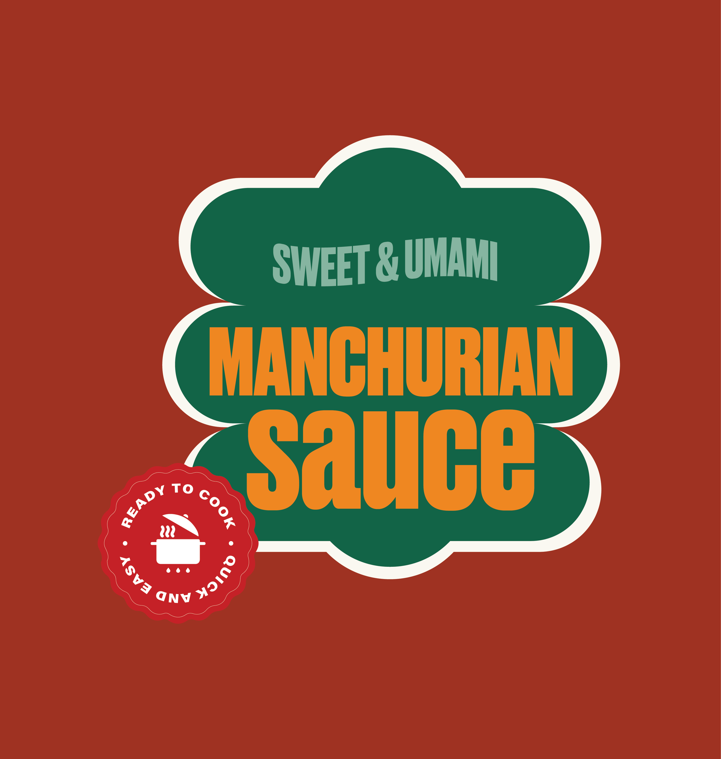
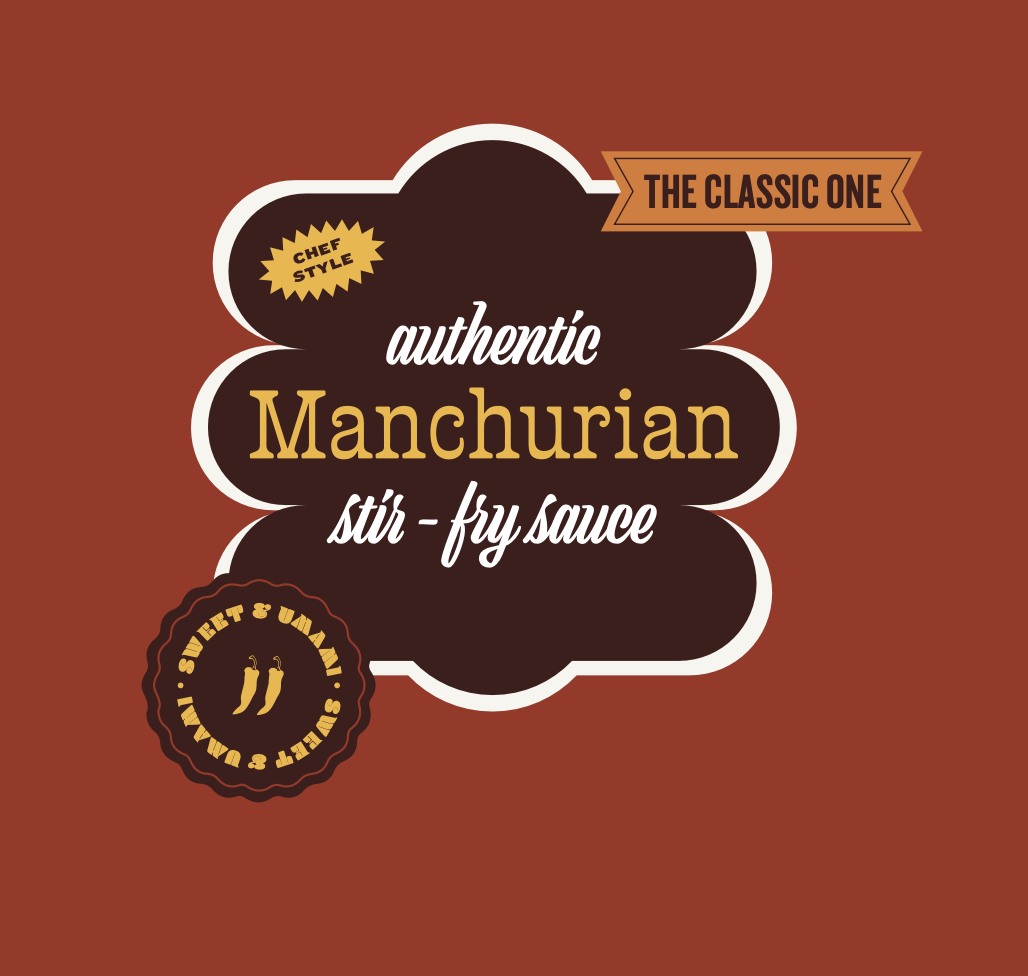
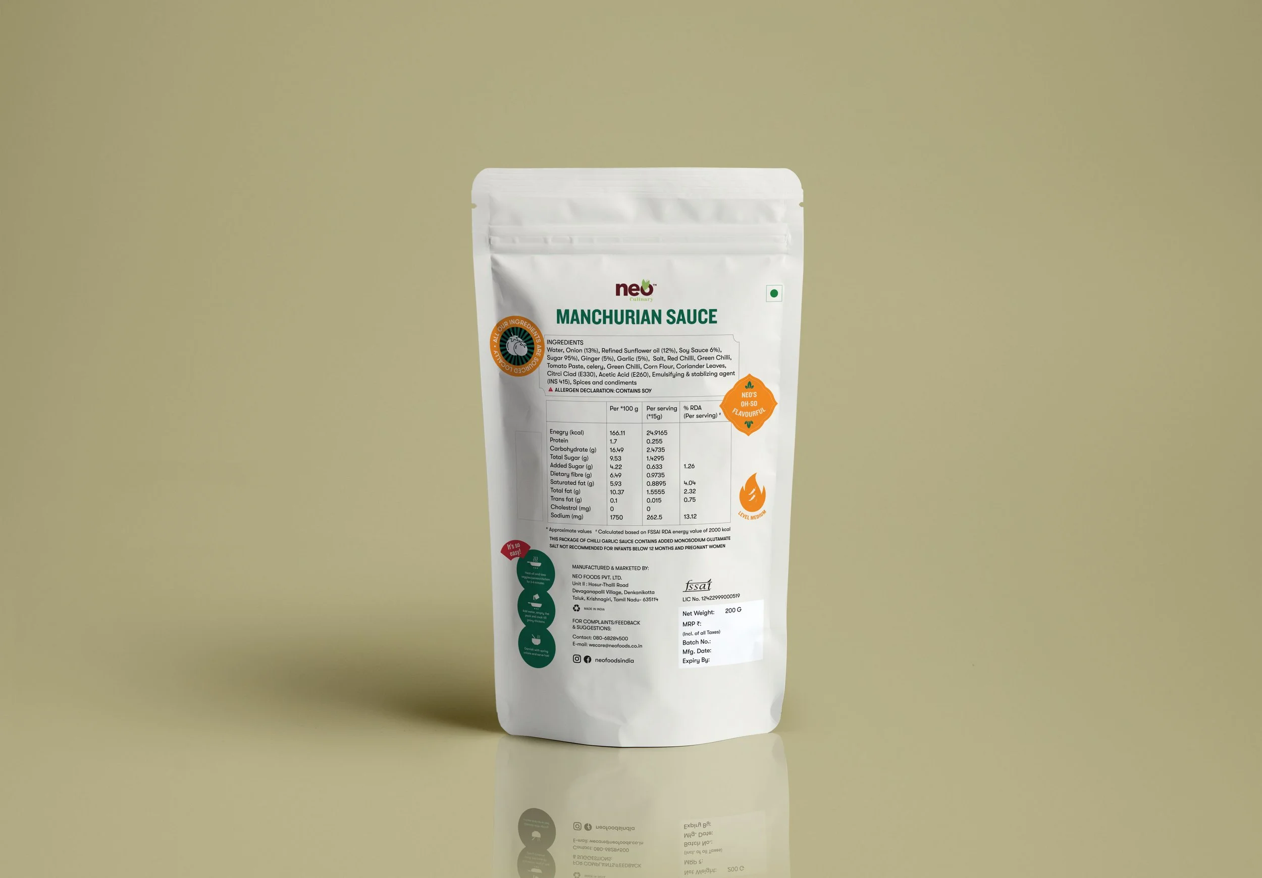
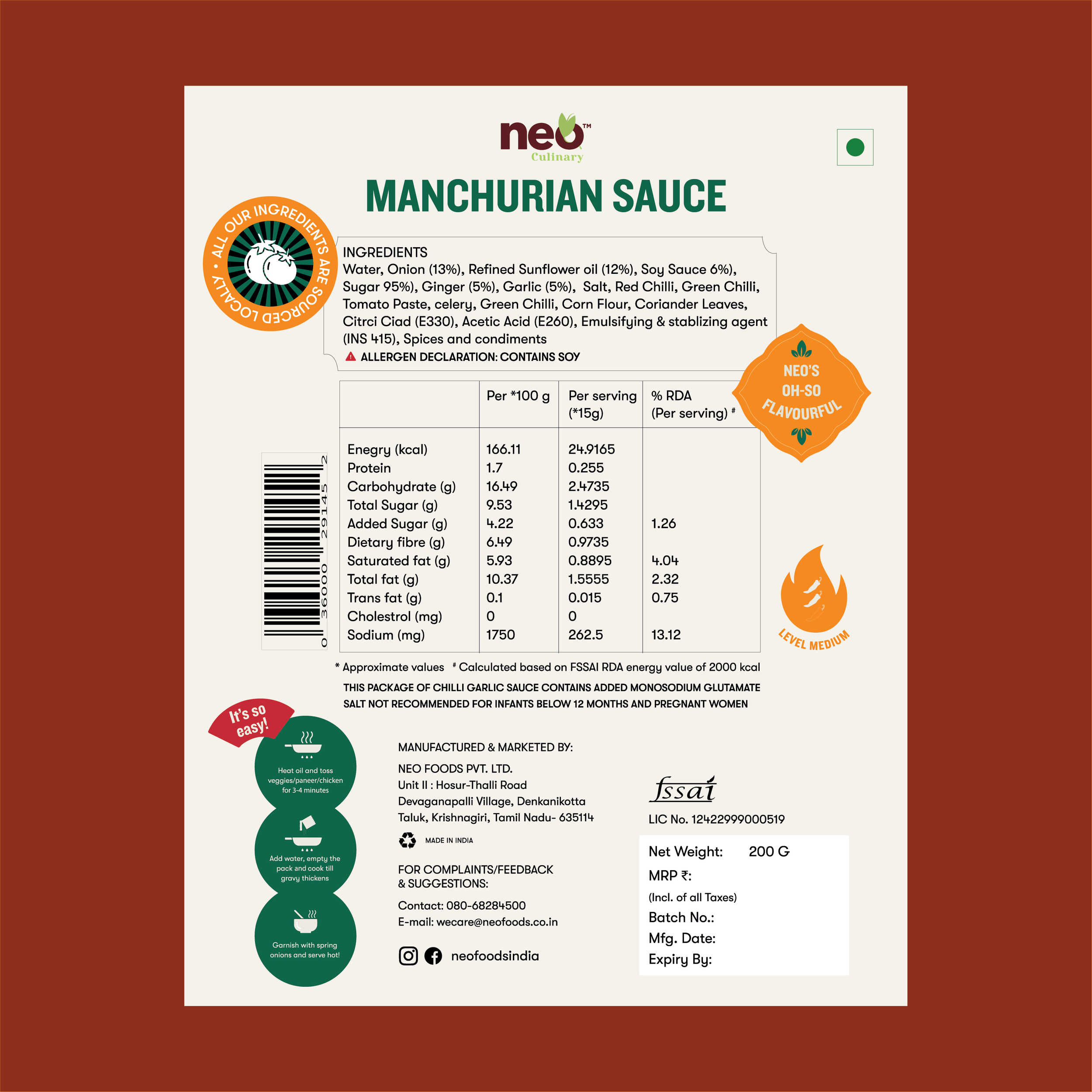
Packaging Design
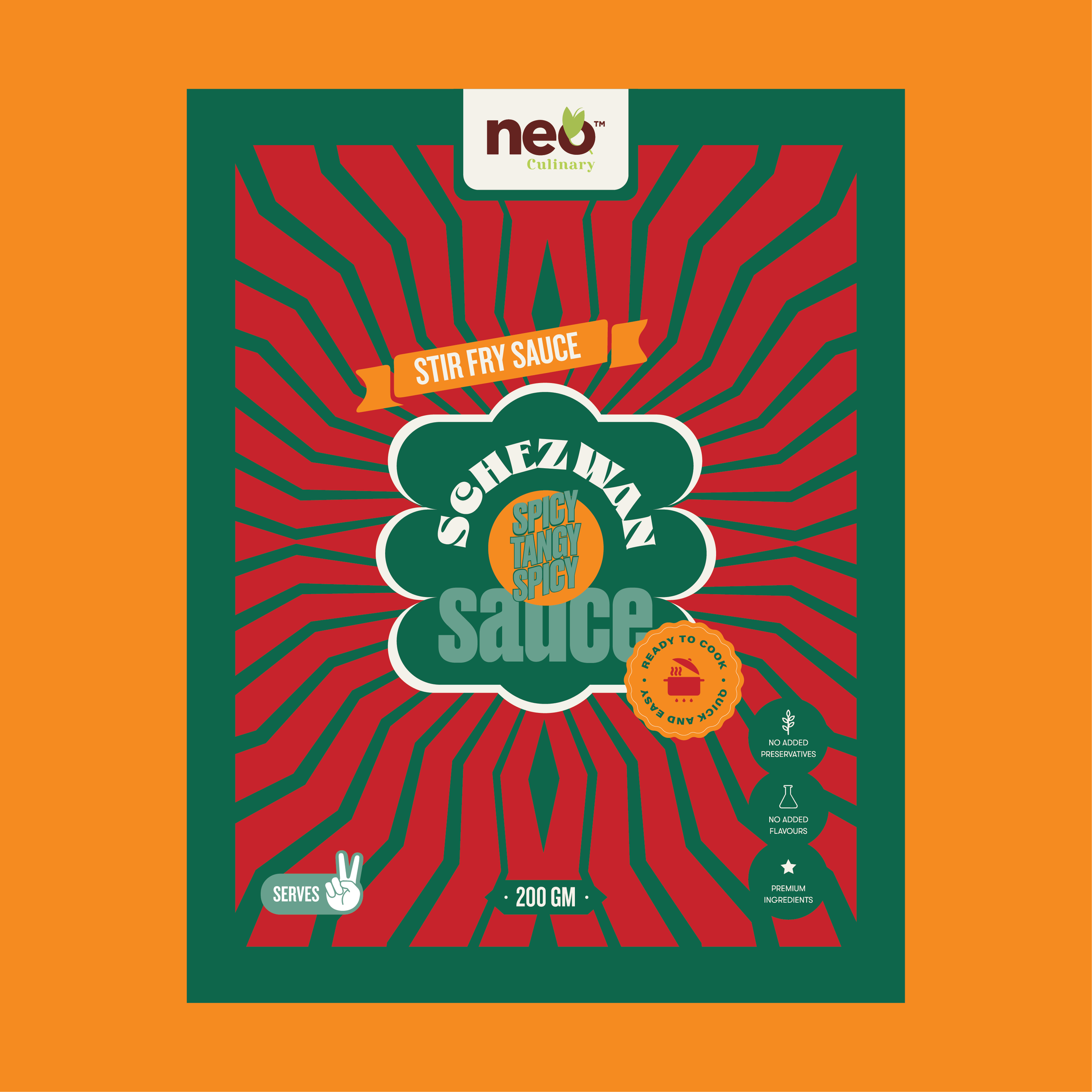
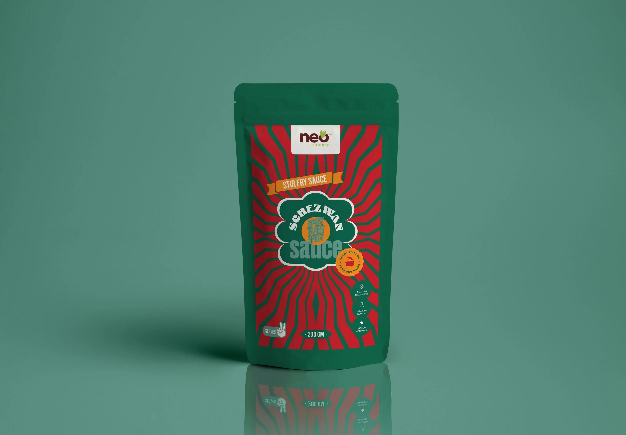
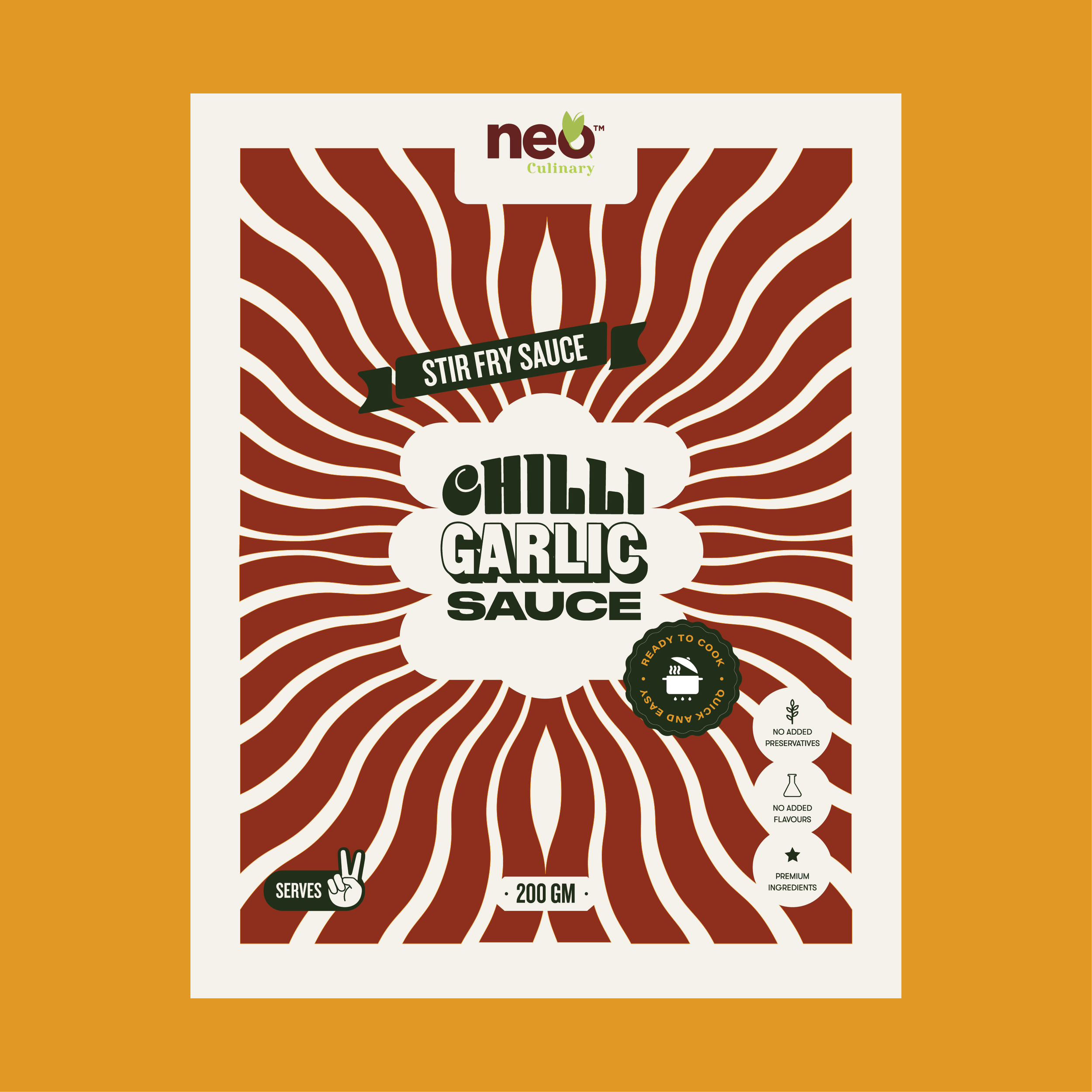
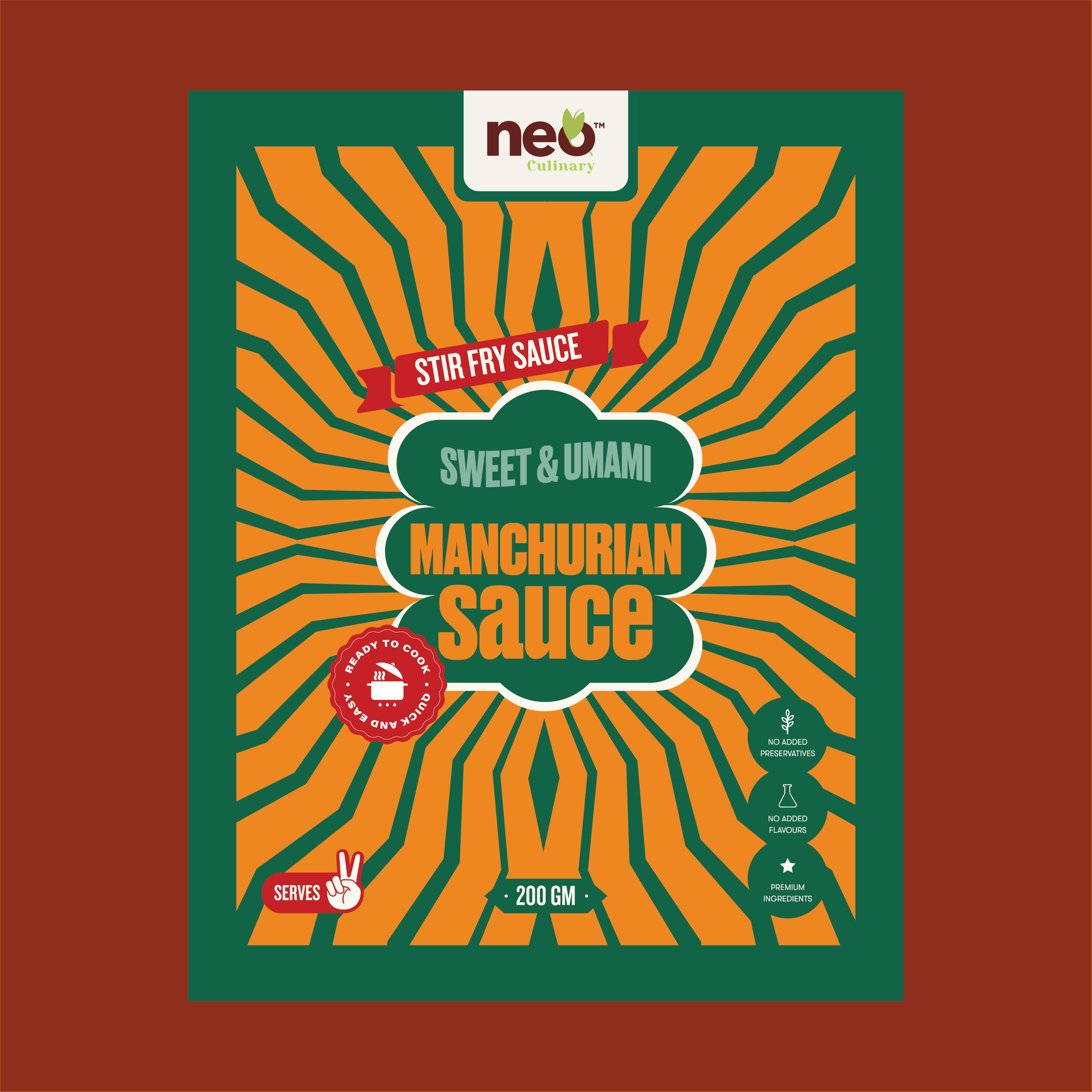
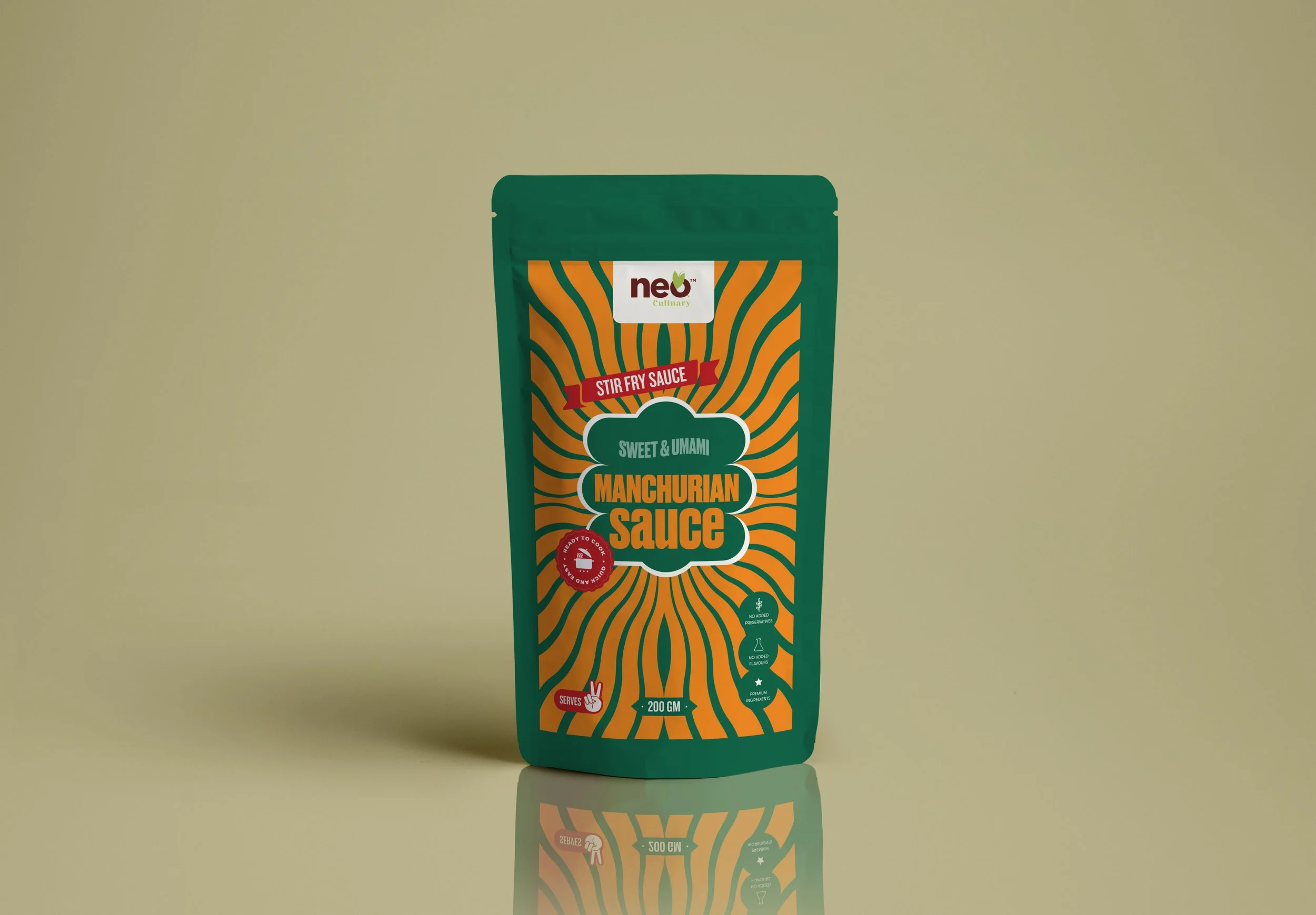
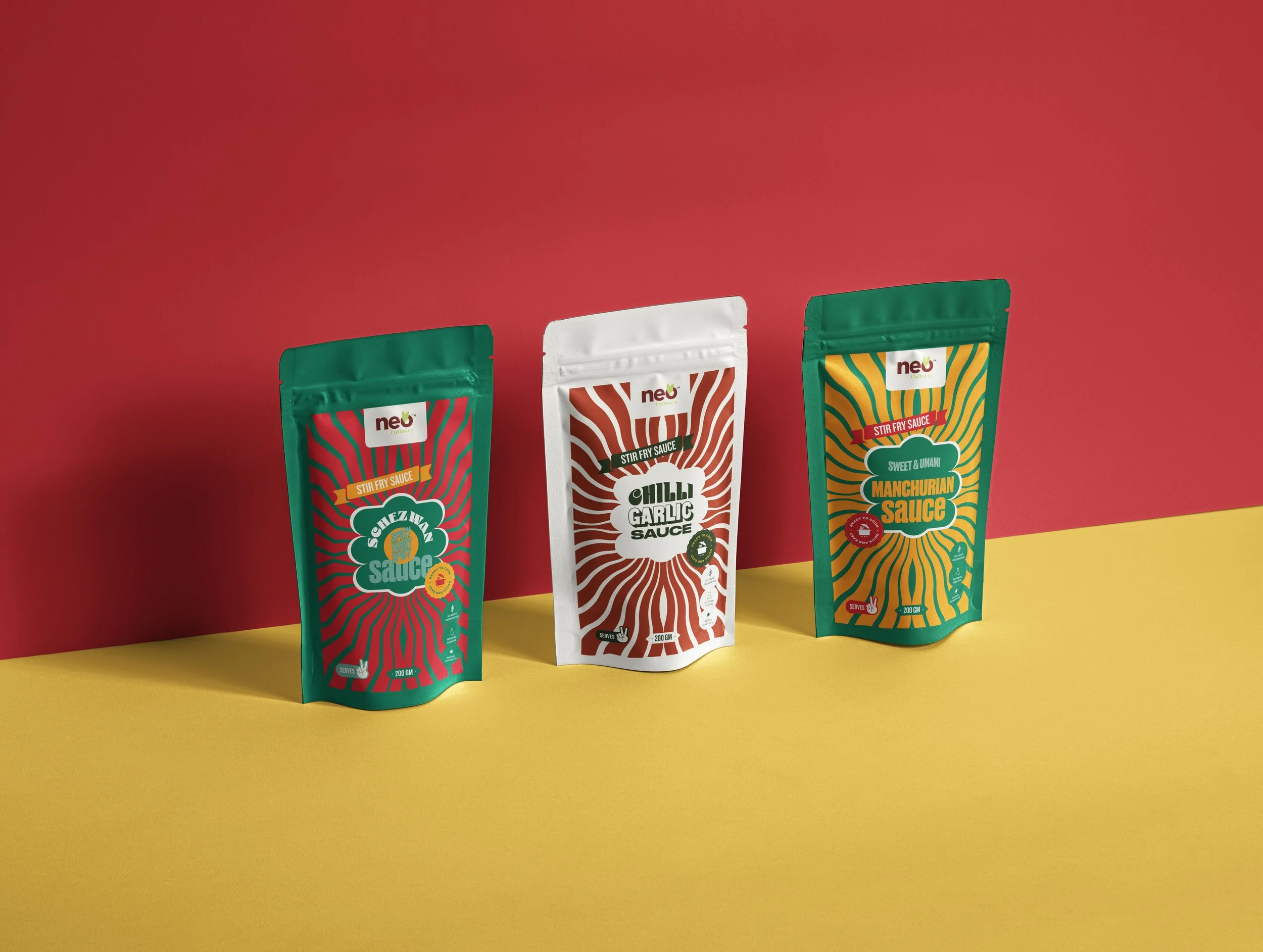
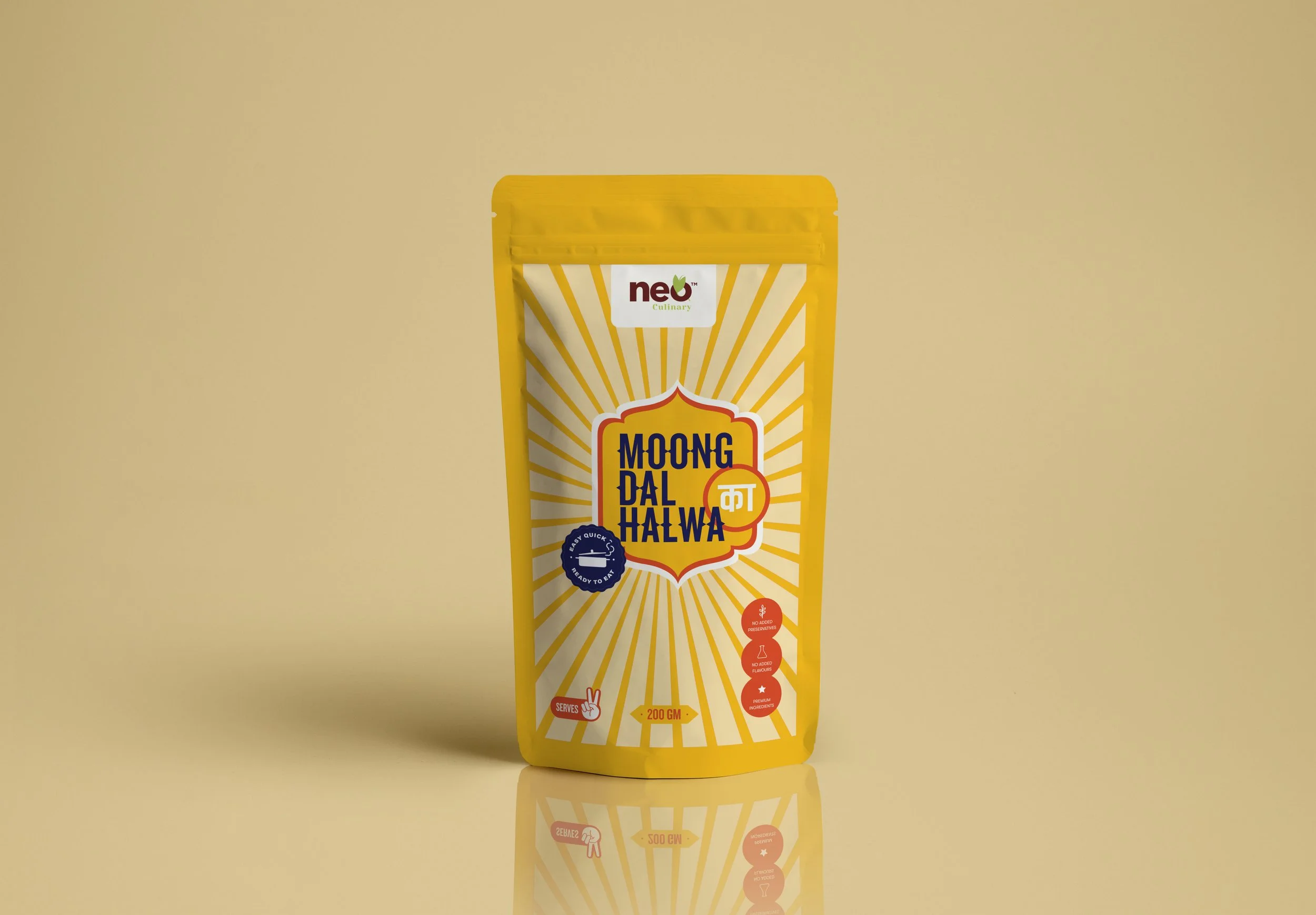
Neo Culinary is a ready-to-eat food brand designed for a young, fast-paced audience seeking convenience without compromising on taste. The brief was to shift the perception of packaged food from generic to fresh and appealing, while reflecting a bold and contemporary brand voice.
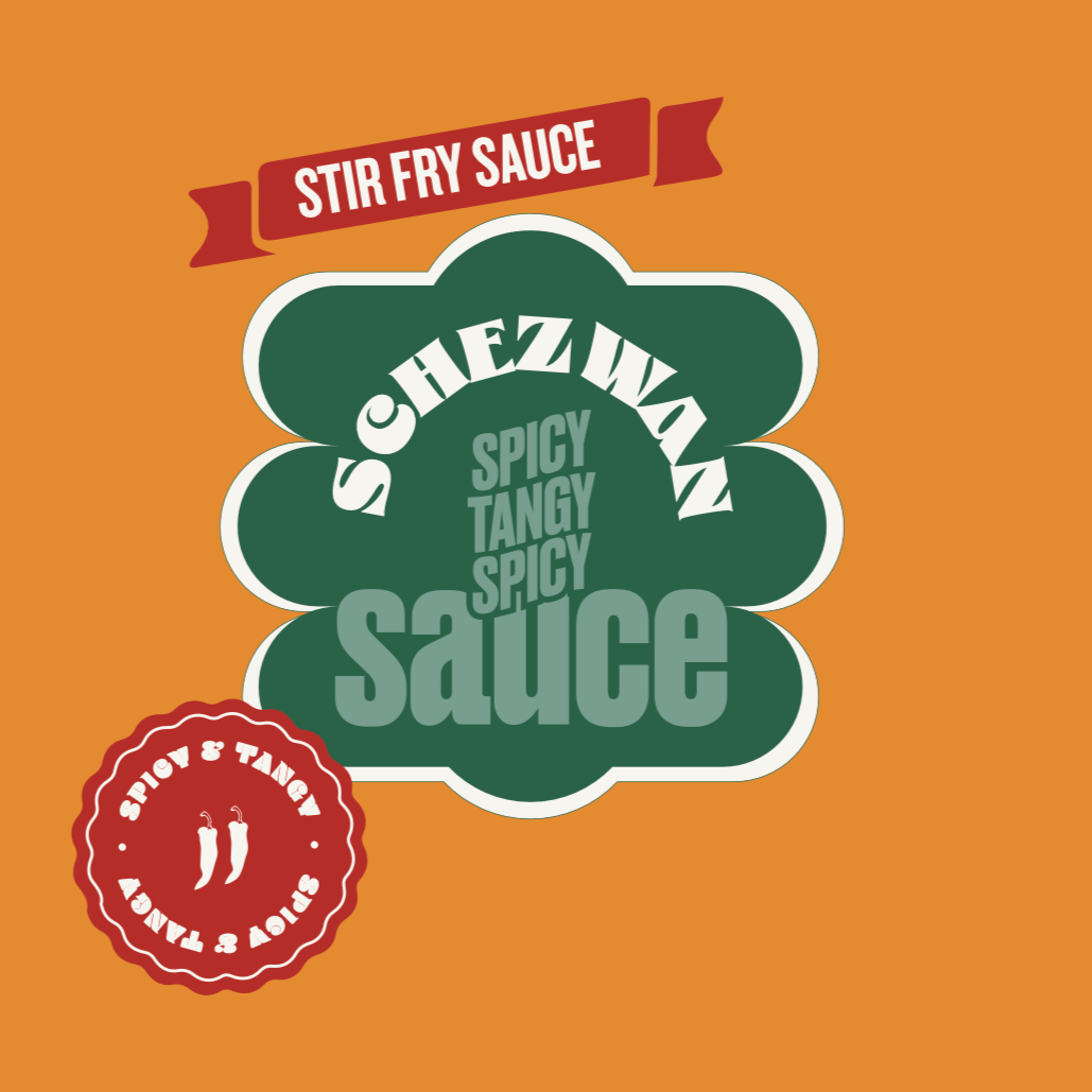
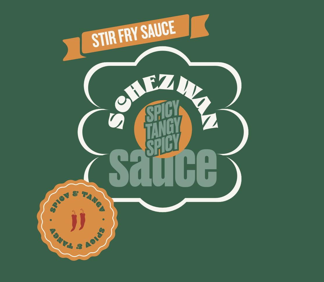
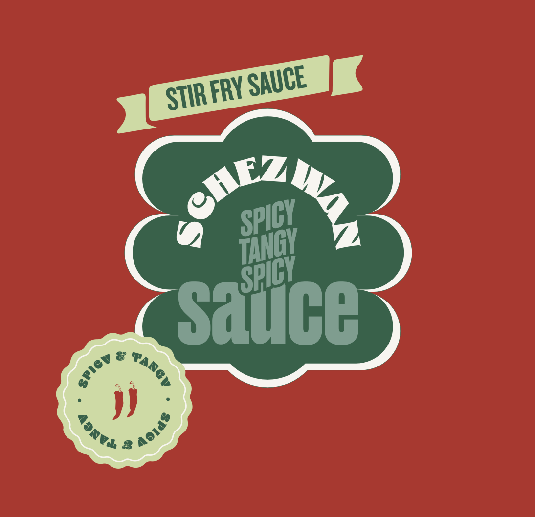
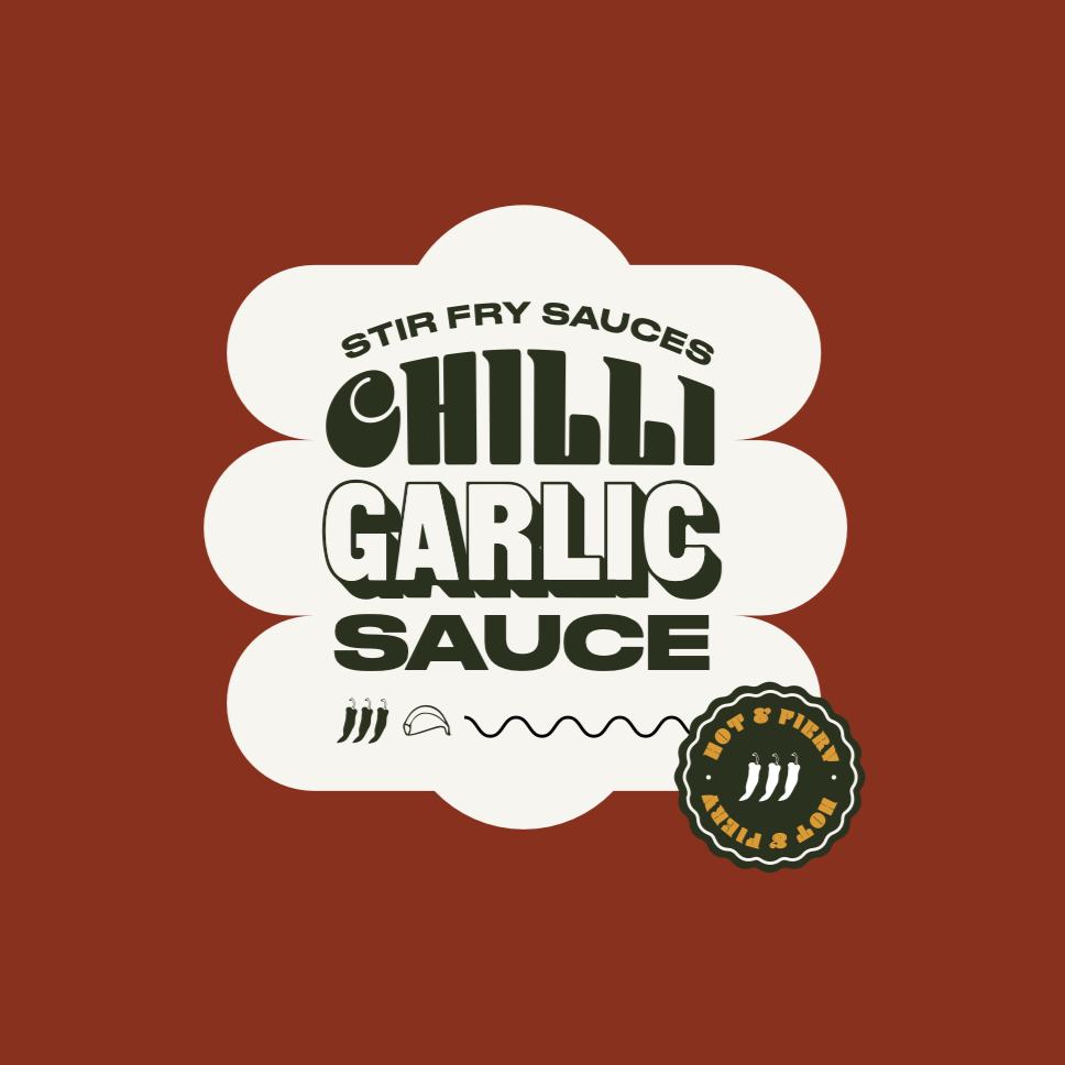
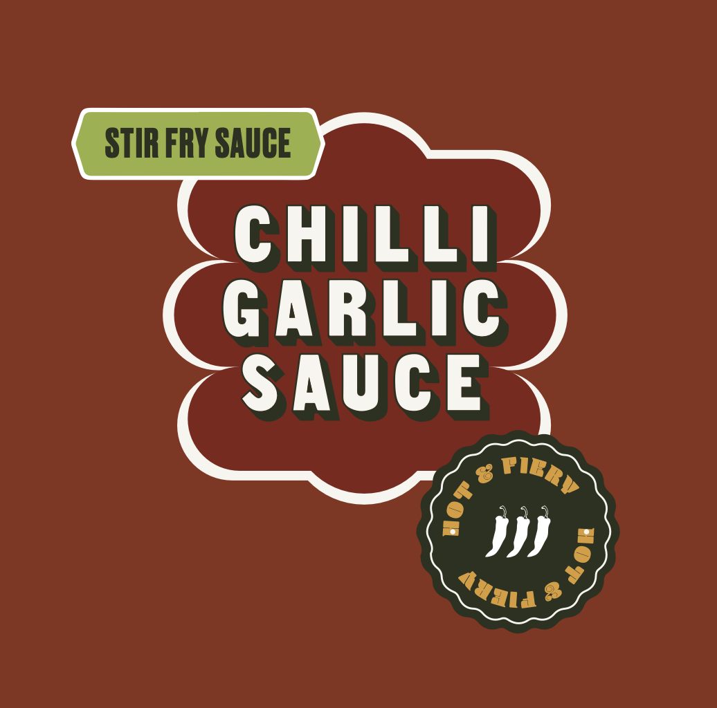
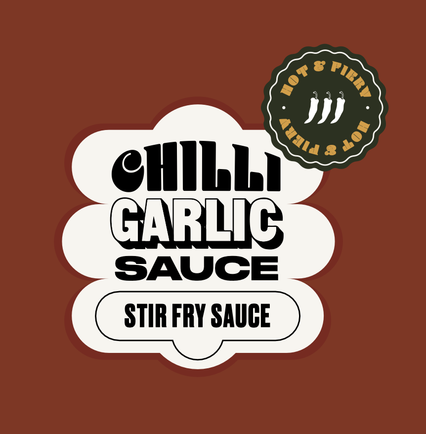
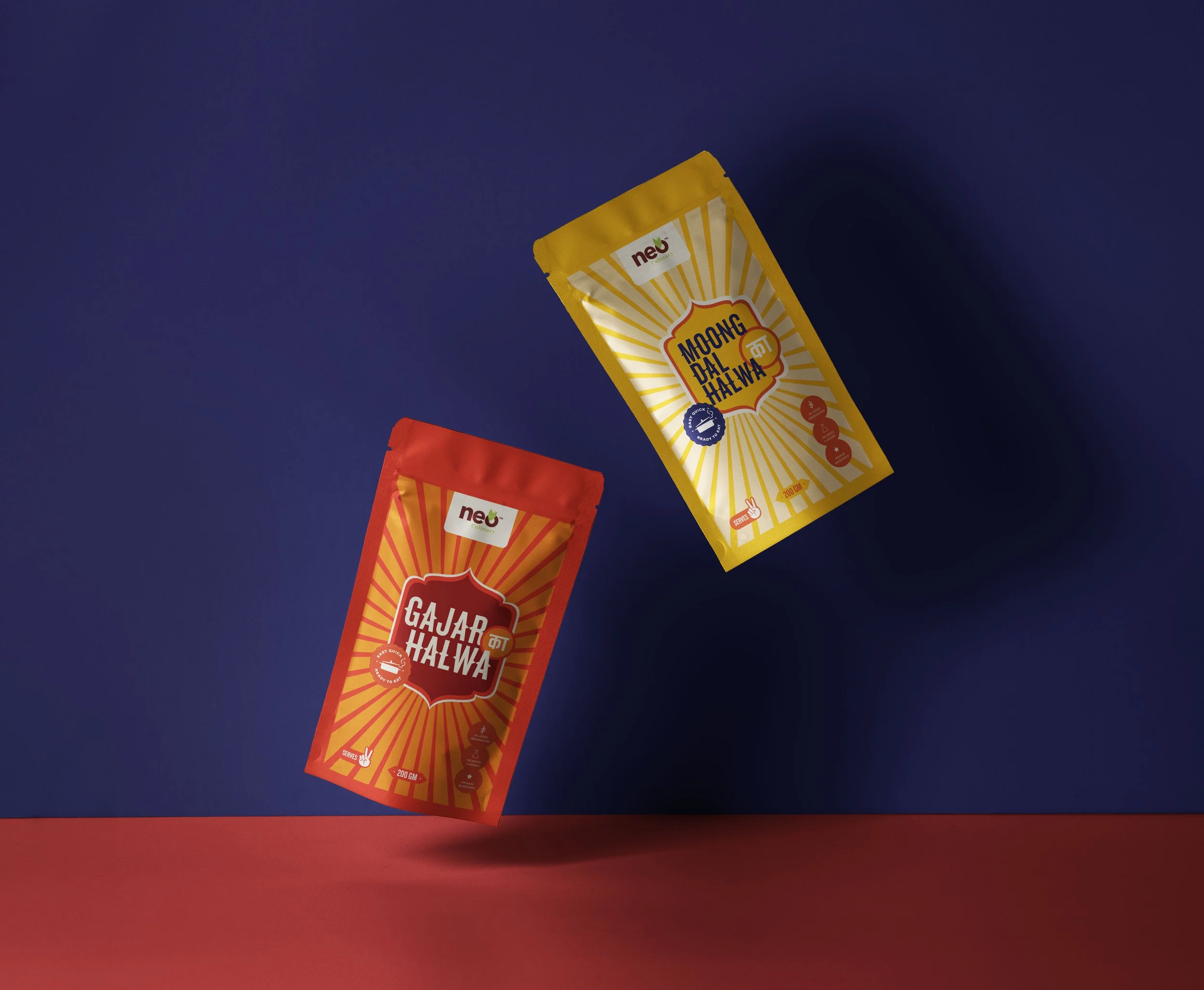
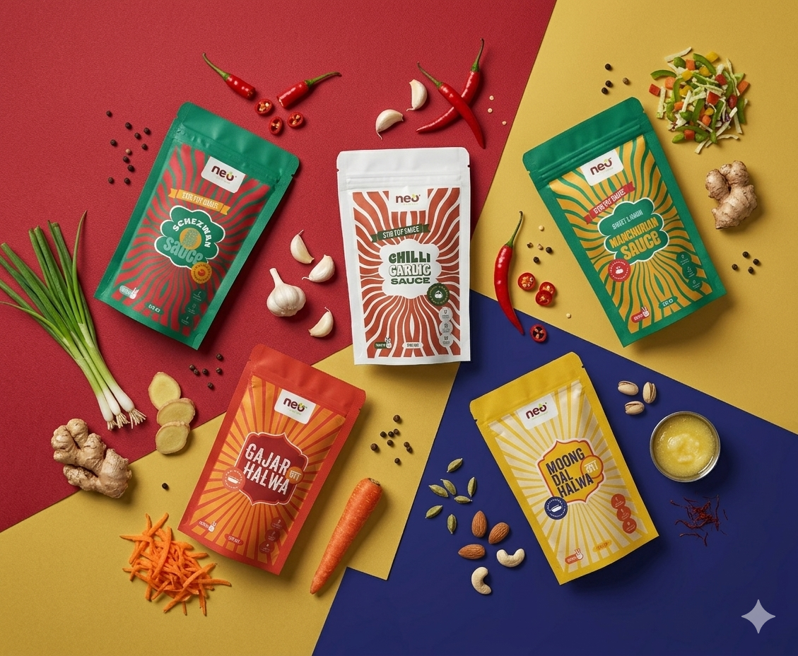
The design focuses on a system-led approach—using a central label, strong typography, and dynamic colour and pattern variations to create a cohesive yet flexible identity across products.

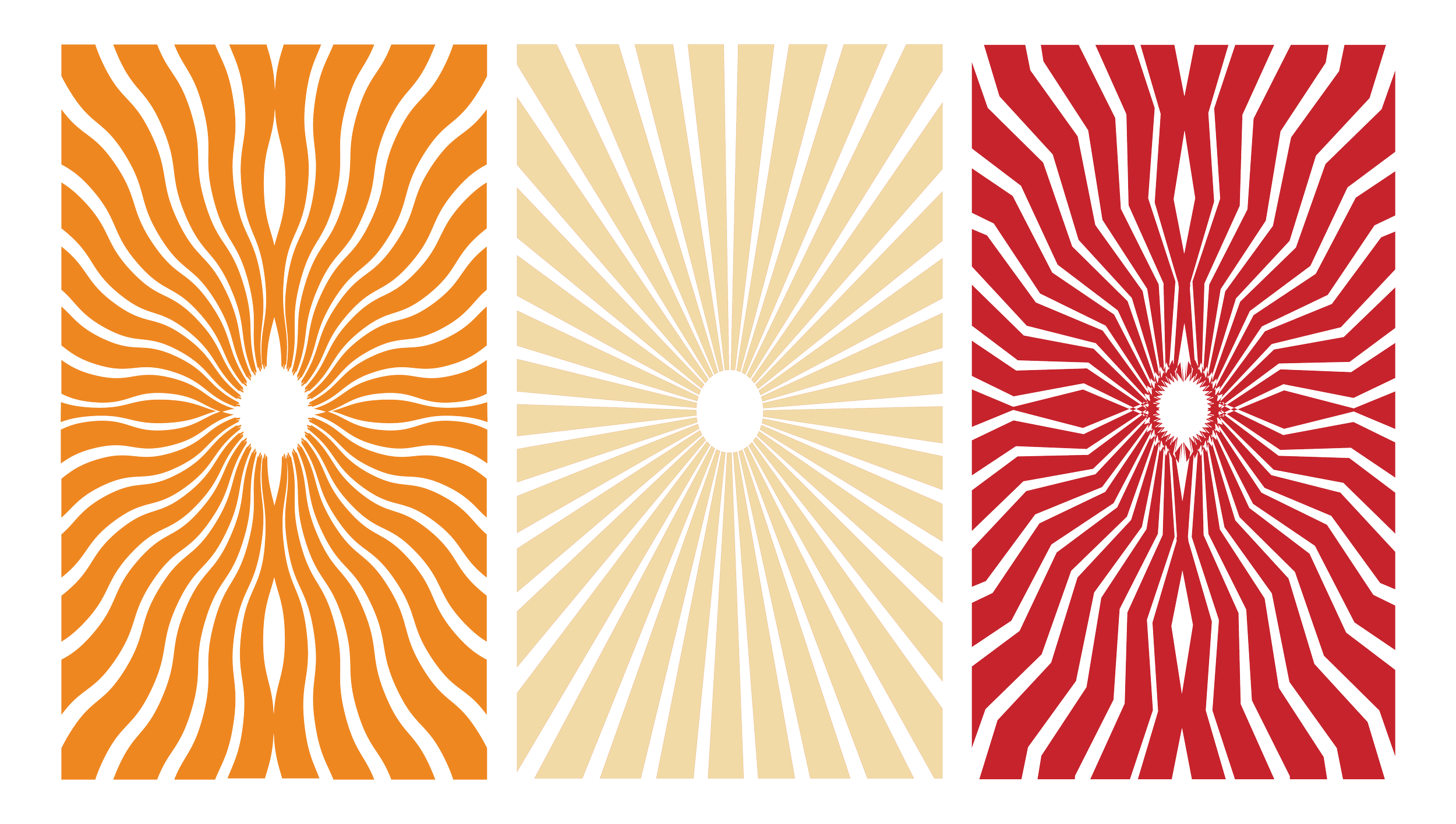
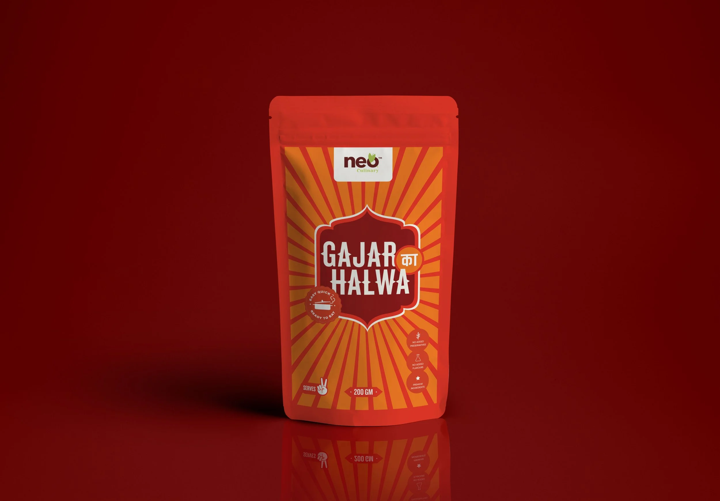
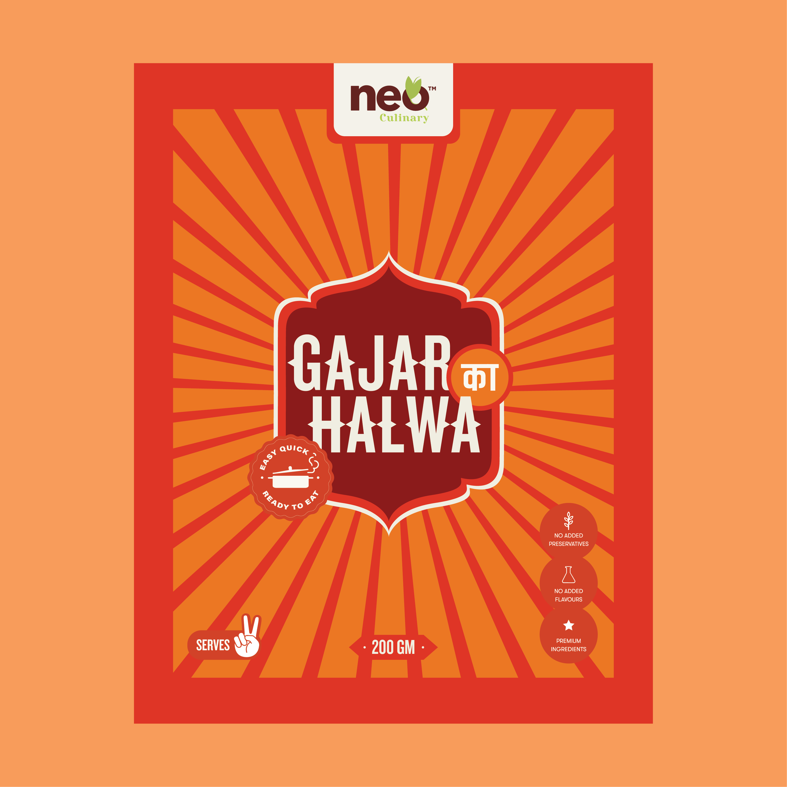
A series of radial patterns were developed to represent the burst of flavours across the range. Each variation responds to the nature of the product—spicier variants use sharper, more erratic forms to convey heat and intensity, while smoother, wavy patterns suggest richness and indulgence.
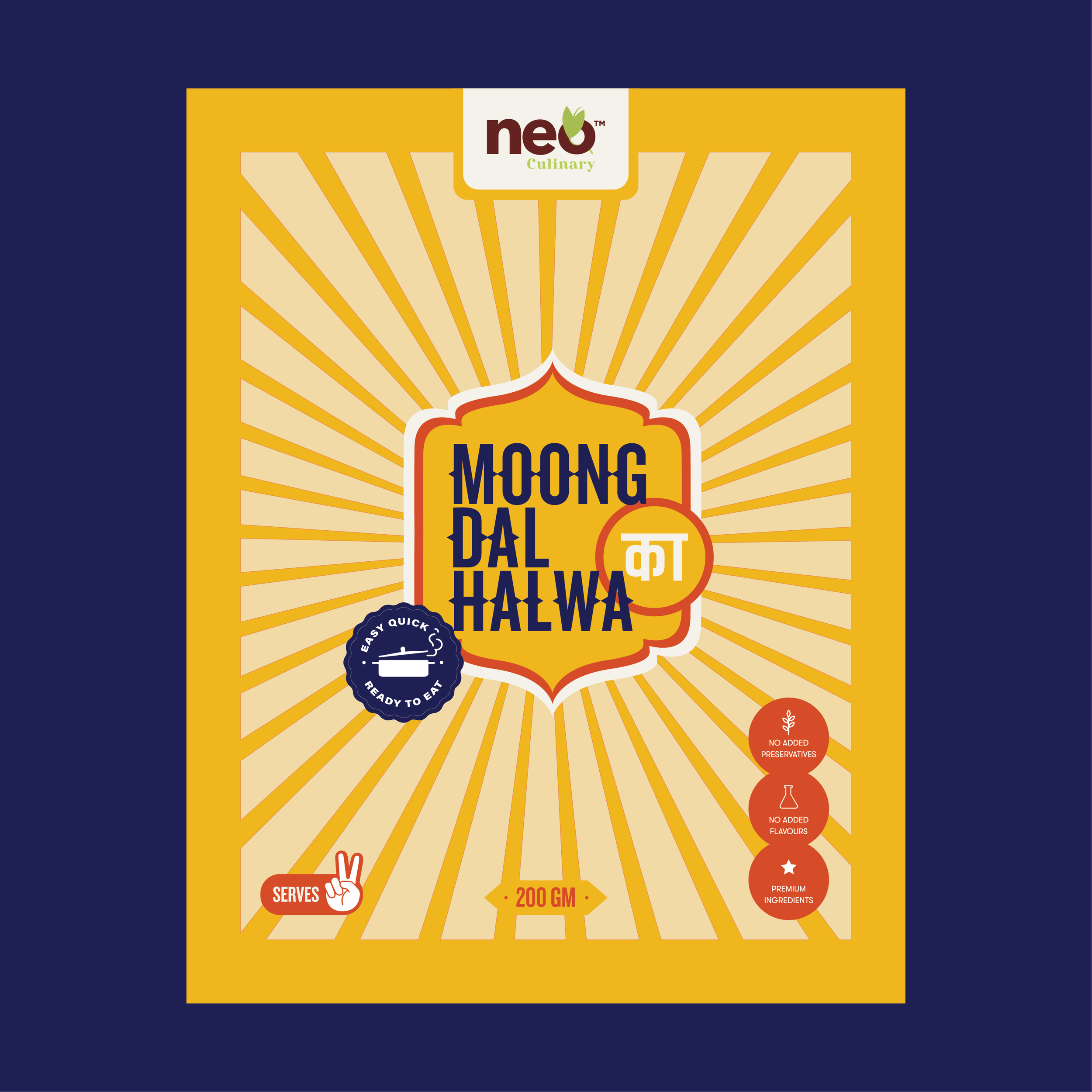
For more traditional or dessert-based products, the patterns become more structured and balanced, reflecting familiarity and comfort. This creates a visual system that is both expressive and scalable across SKUs.
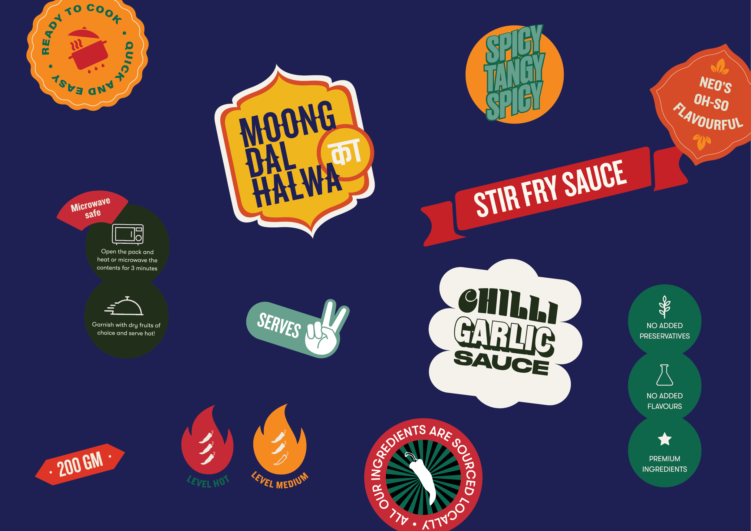
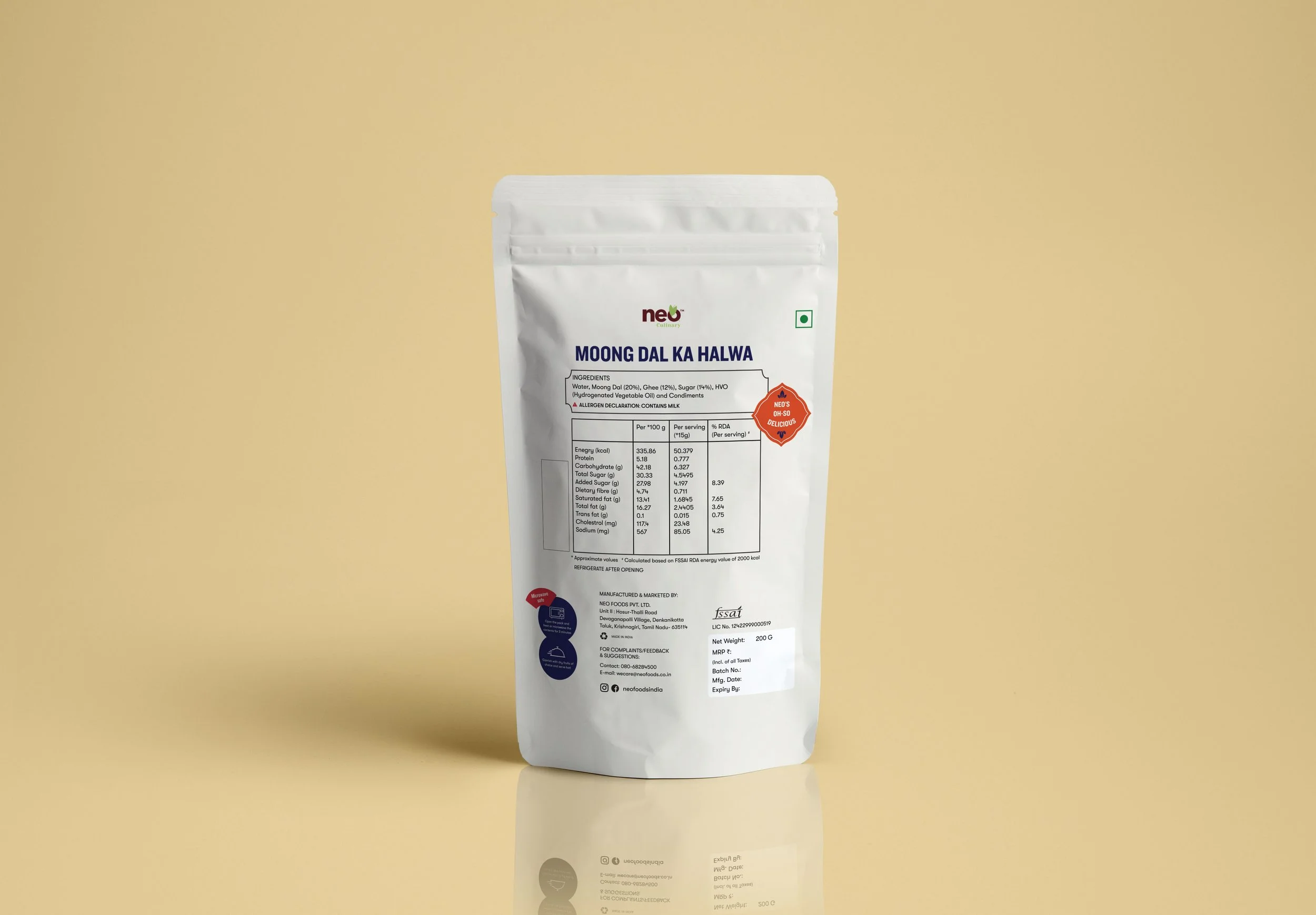
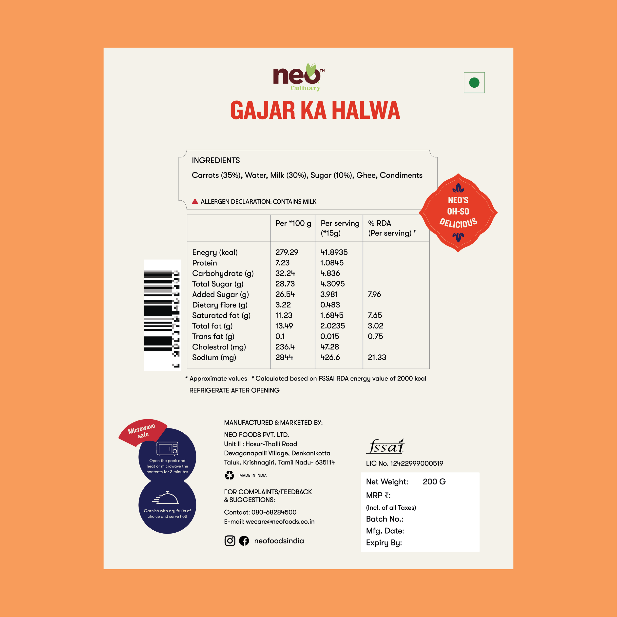
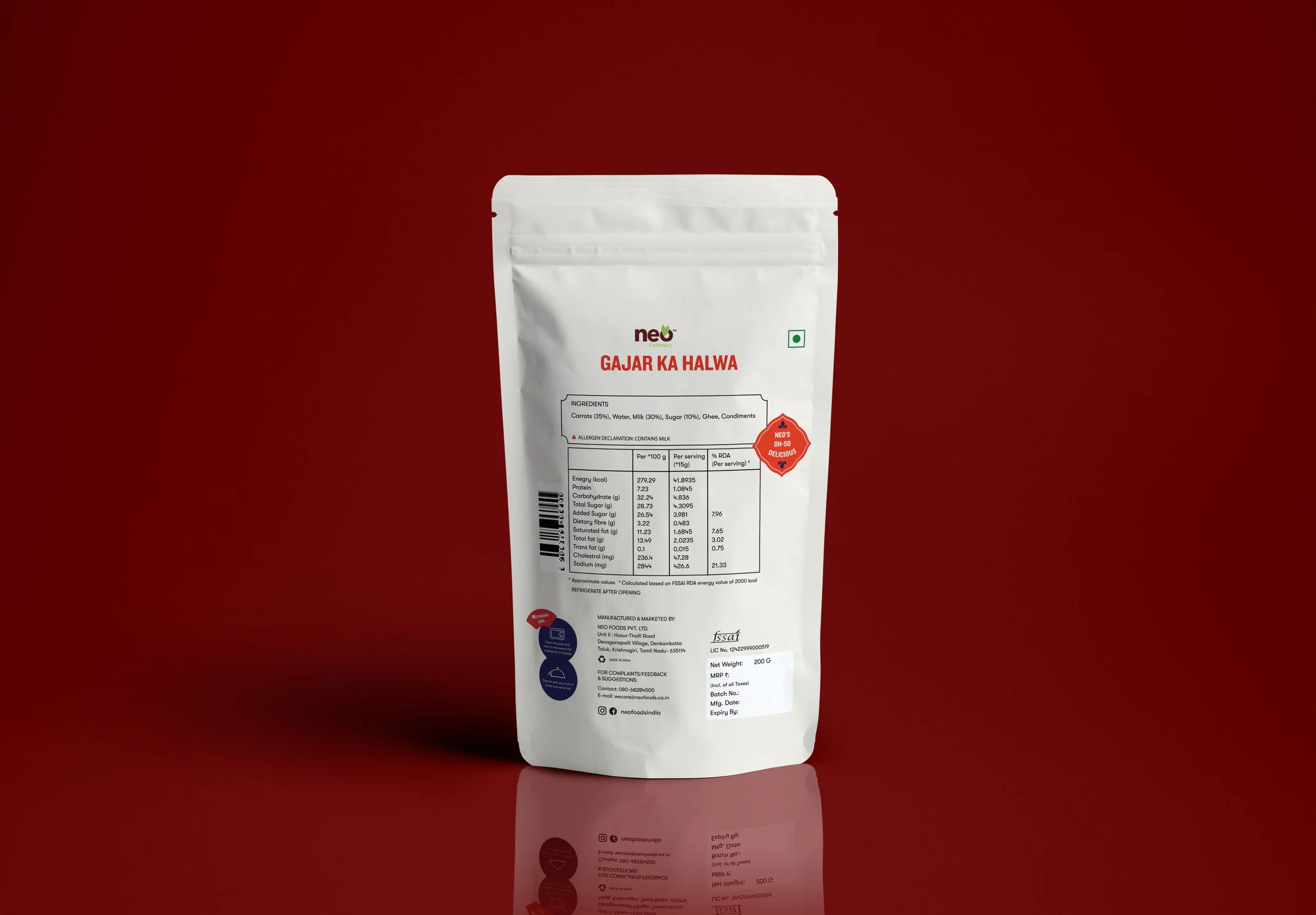
A flexible set of graphic elements was created to communicate key product information in a more engaging way. From badges and icons to flavour indicators and callouts, these elements help break down information into quick, digestible cues.
The forms and colours are intentionally bold and playful, reinforcing the brand’s expressive personality while ensuring clarity and ease of use across the packaging.