
MOONWELL
YEAR / 2026
Brand Overview:
visual identity /packaging /social media
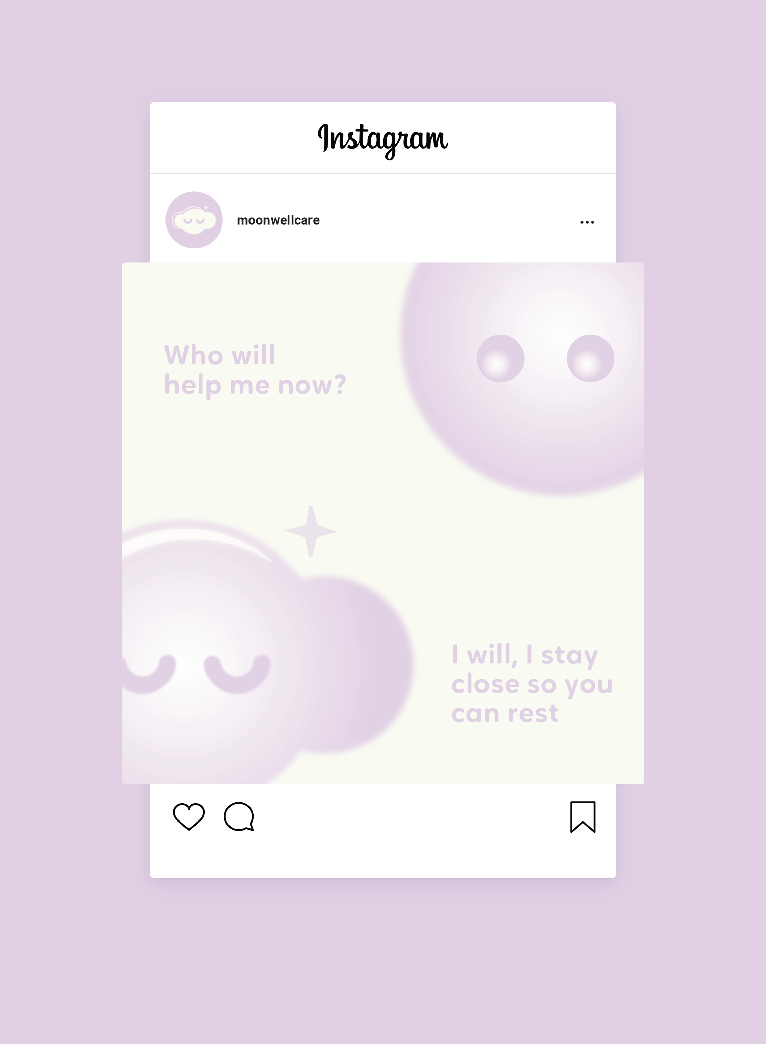
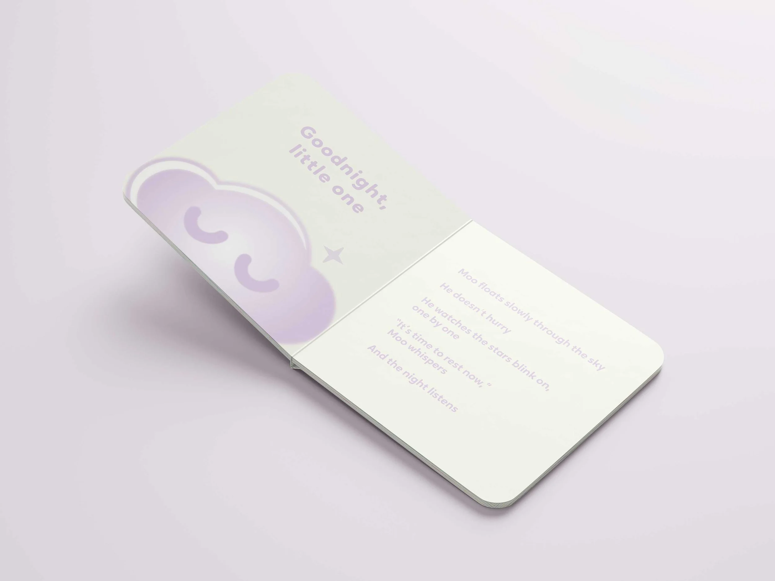
Moonwell is a conceptual baby bedtime ritual brand built around the idea that sleep is a transition, not a task. Rooted in softness, repetition, and sensory cues, the identity is designed to create a calm and reassuring experience for both babies and parents. The system translates these ideas into a visual language that feels gentle, cyclical, and quietly immersive.


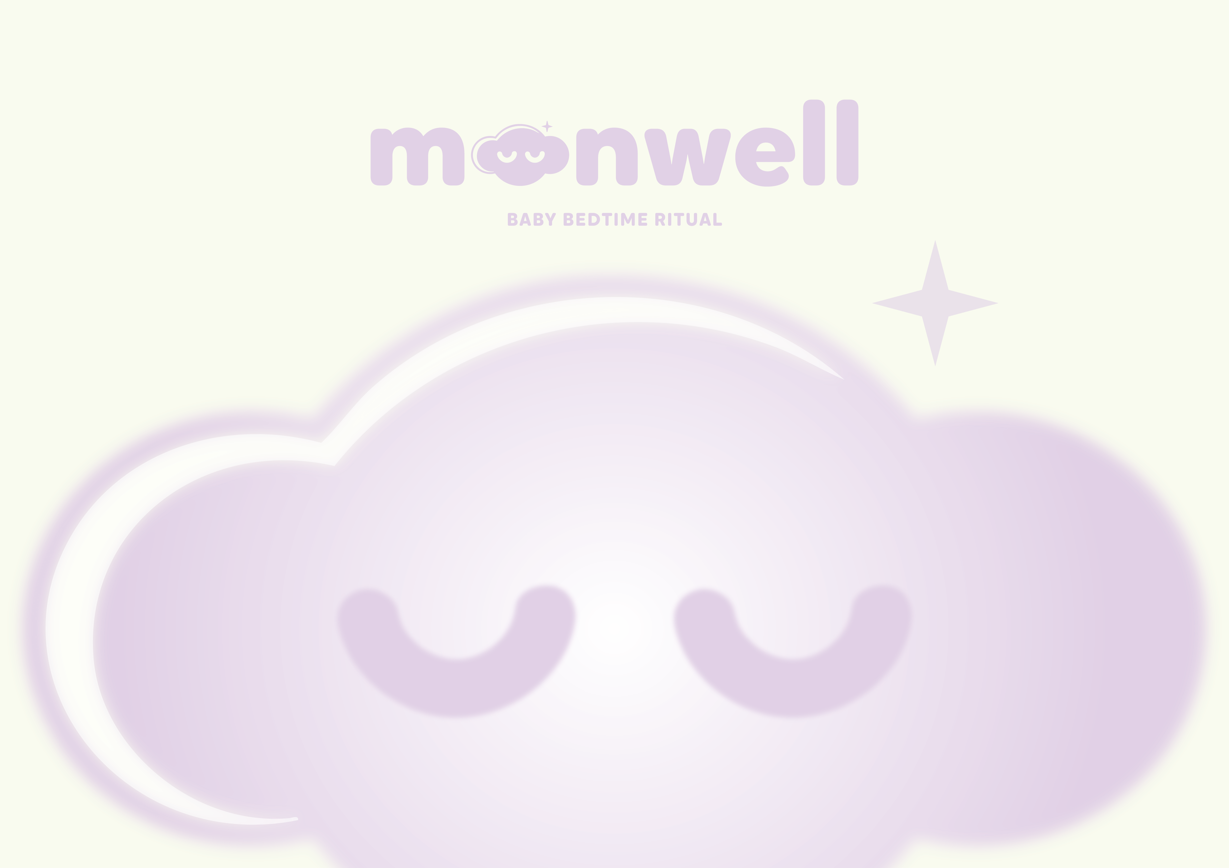
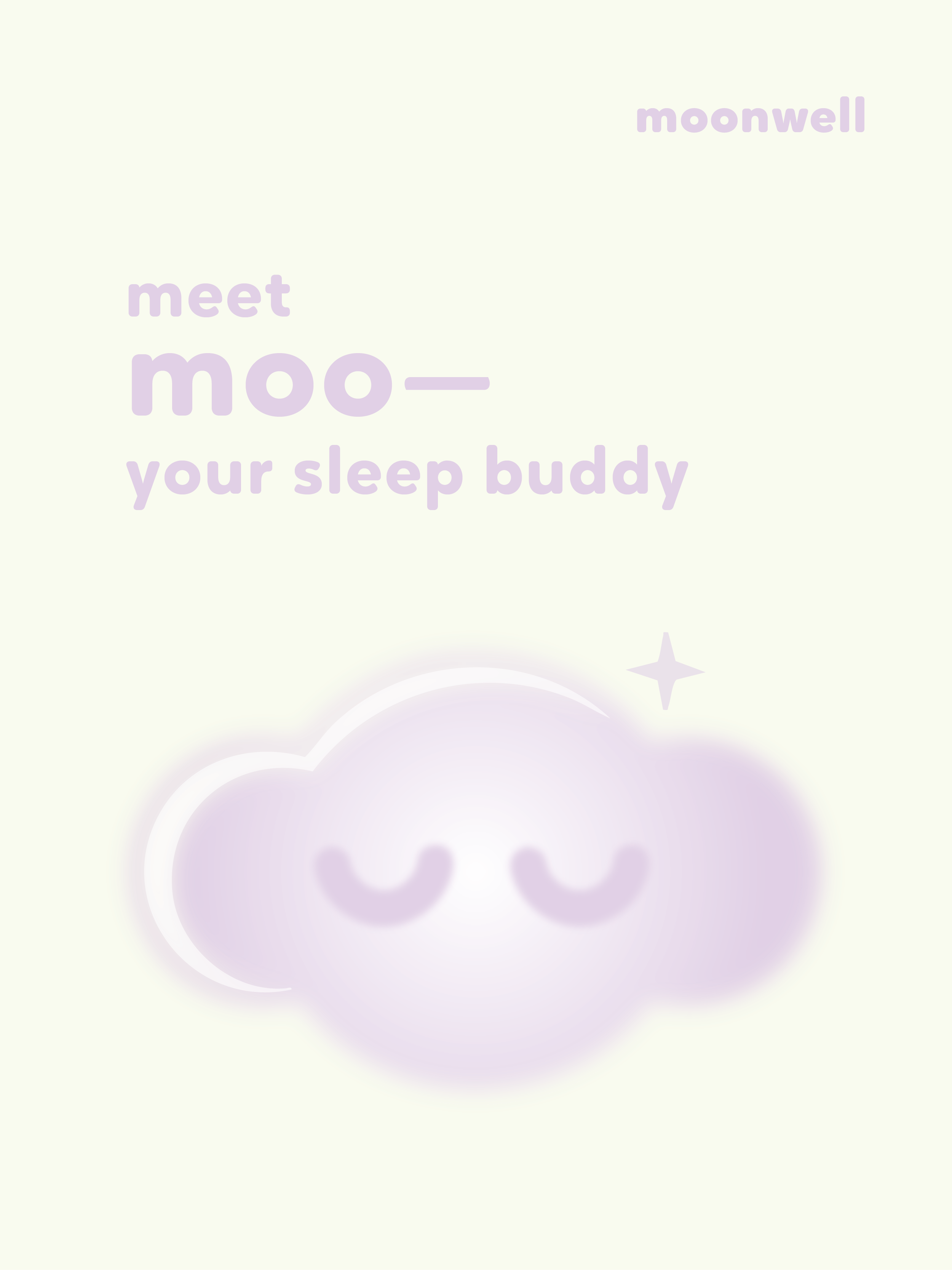
The cloud form merges the two ‘o’s in the logotype, creating a distinctive identity element. Designed as a soft, sleeping character, it becomes a recurring motif that can function both within the logo and as a standalone element across applications.

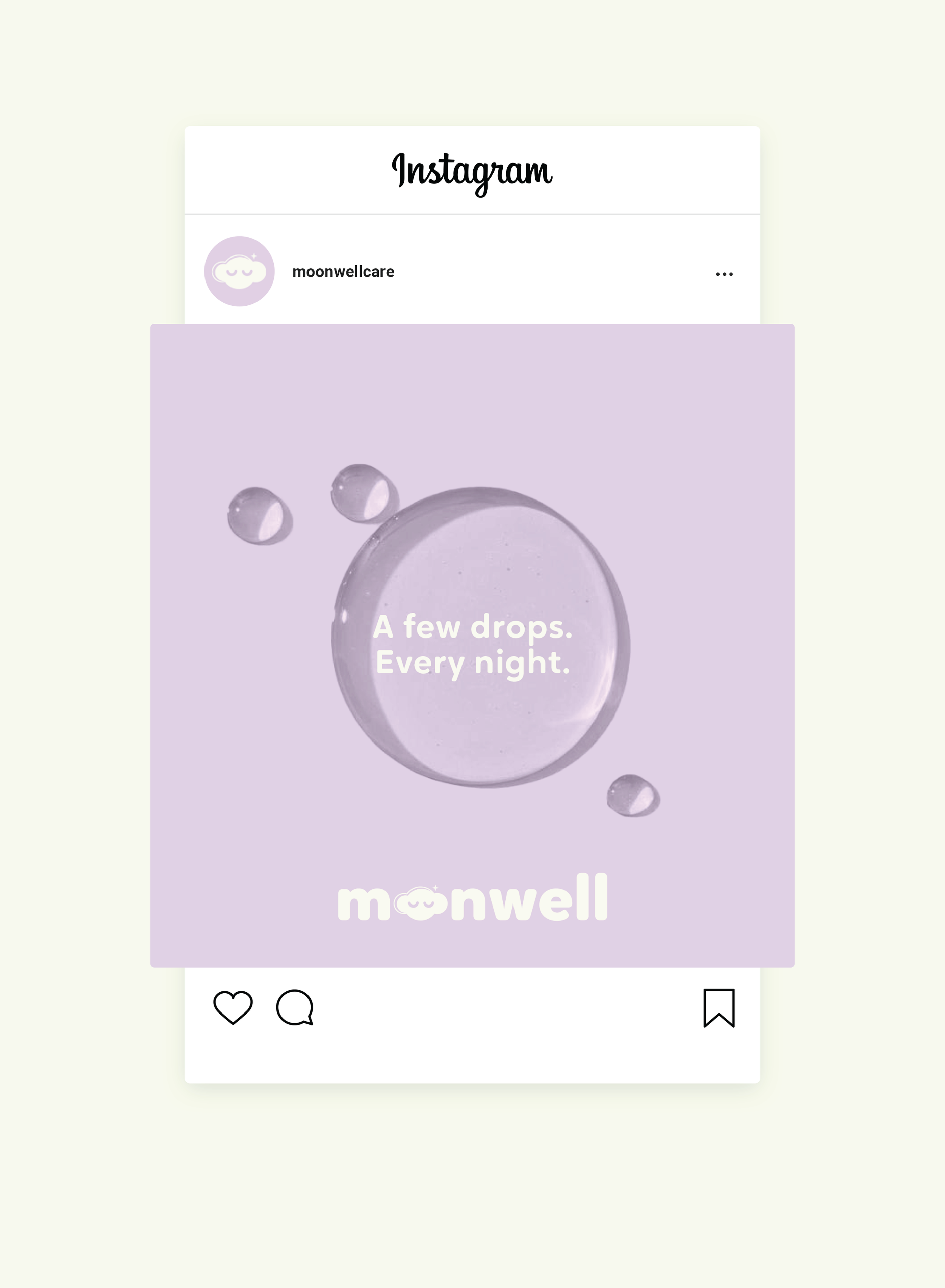
Made for moments before sleep
Made for moments before sleep
Made for moments before sleep
Made for moments before sleep Made for moments before sleep Made for moments before sleep
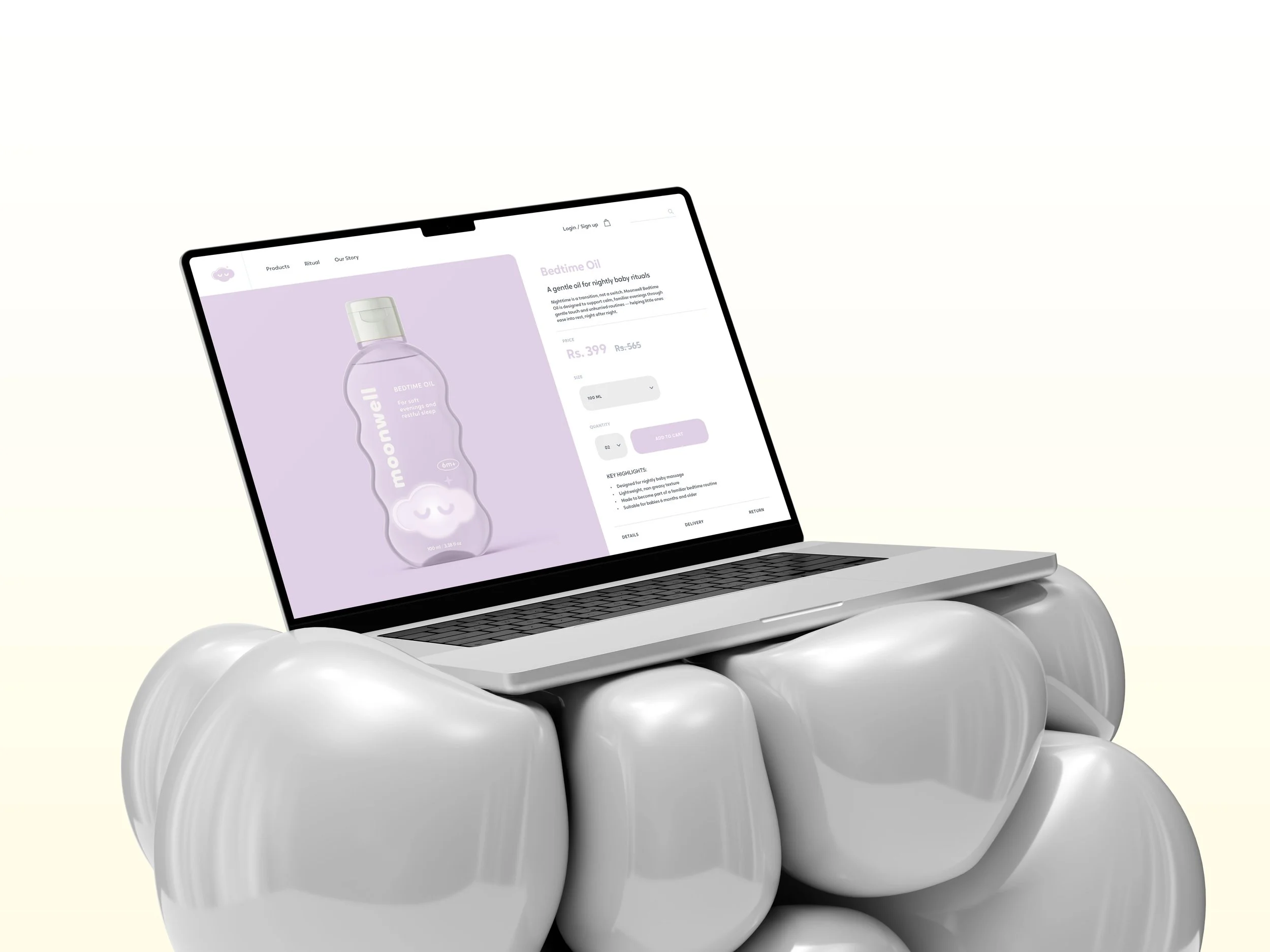
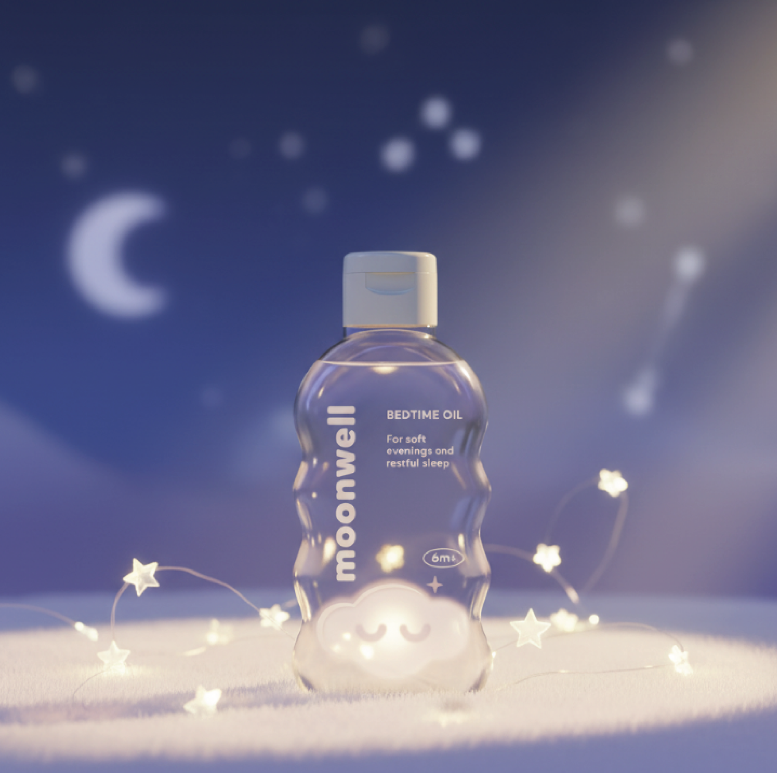
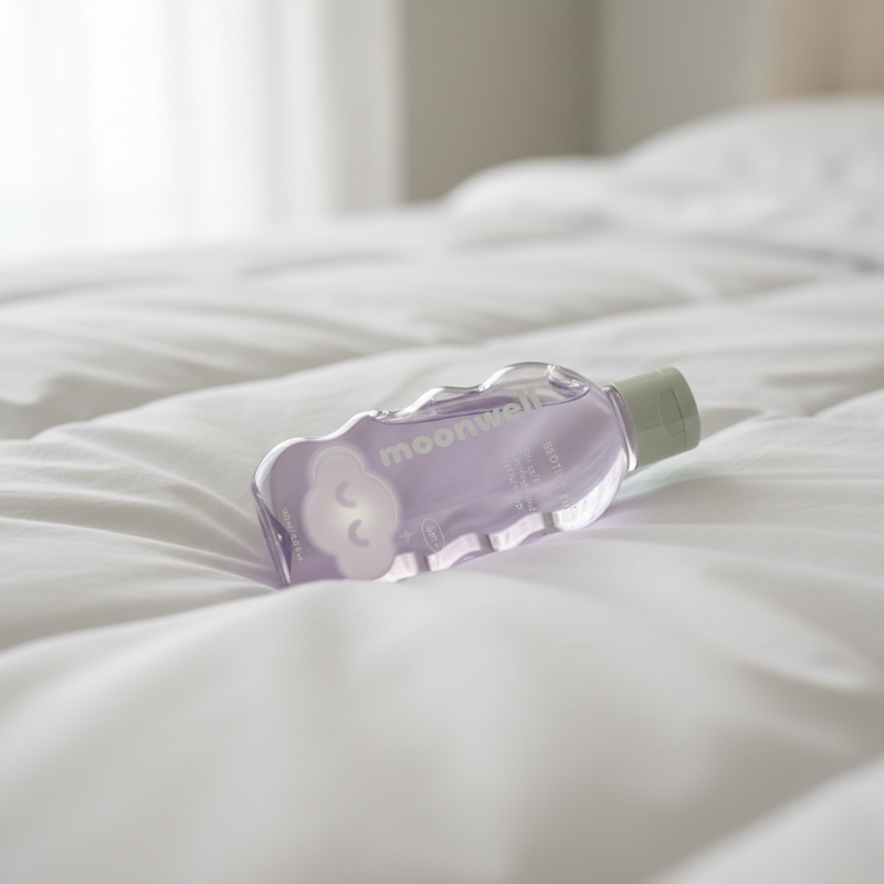
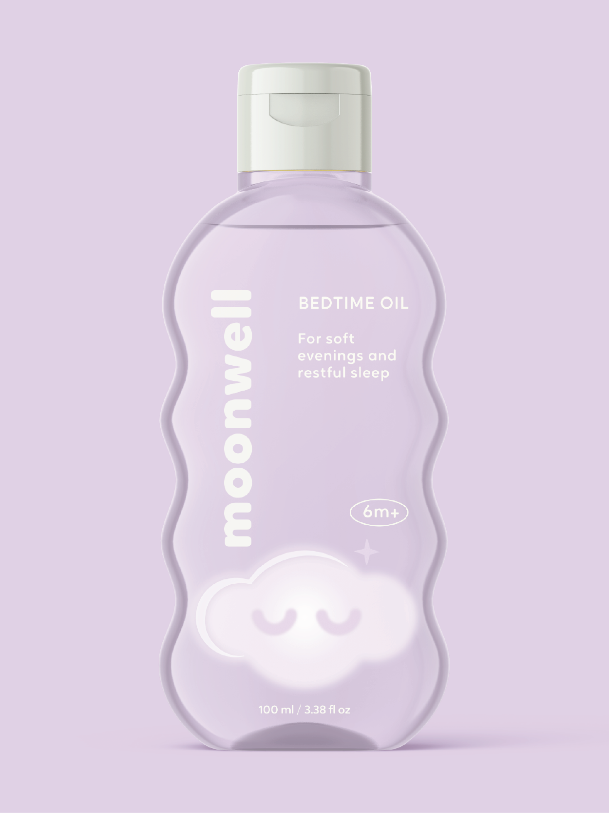
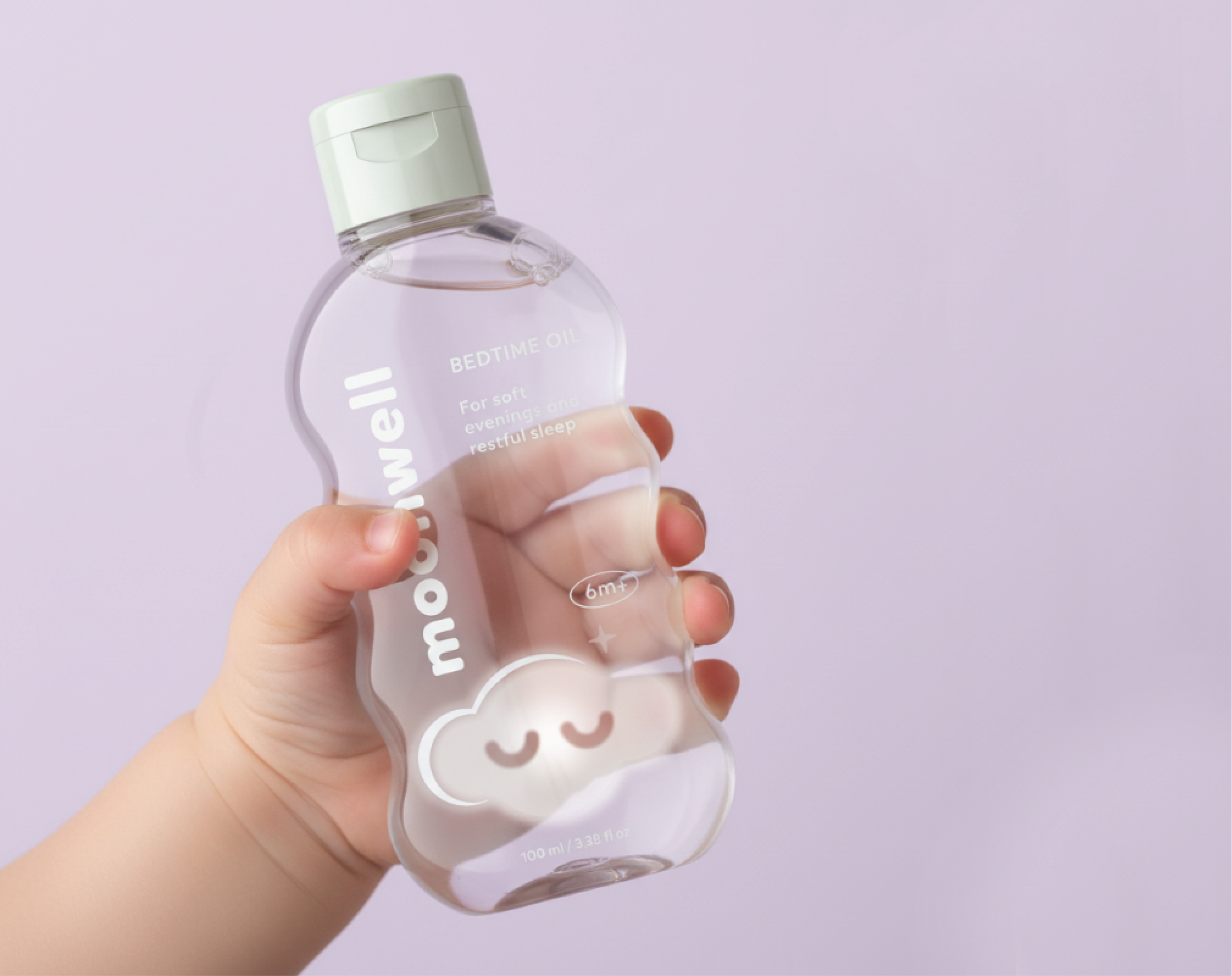
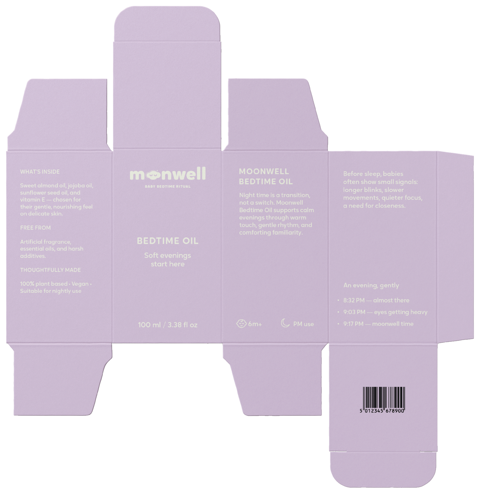
The bottle’s soft, contoured form is designed to feel gentle and tactile in hand.
Paired with a muted palette and minimal information, the packaging reduces visual noise; creating a calm, reassuring presence suited to bedtime routines.
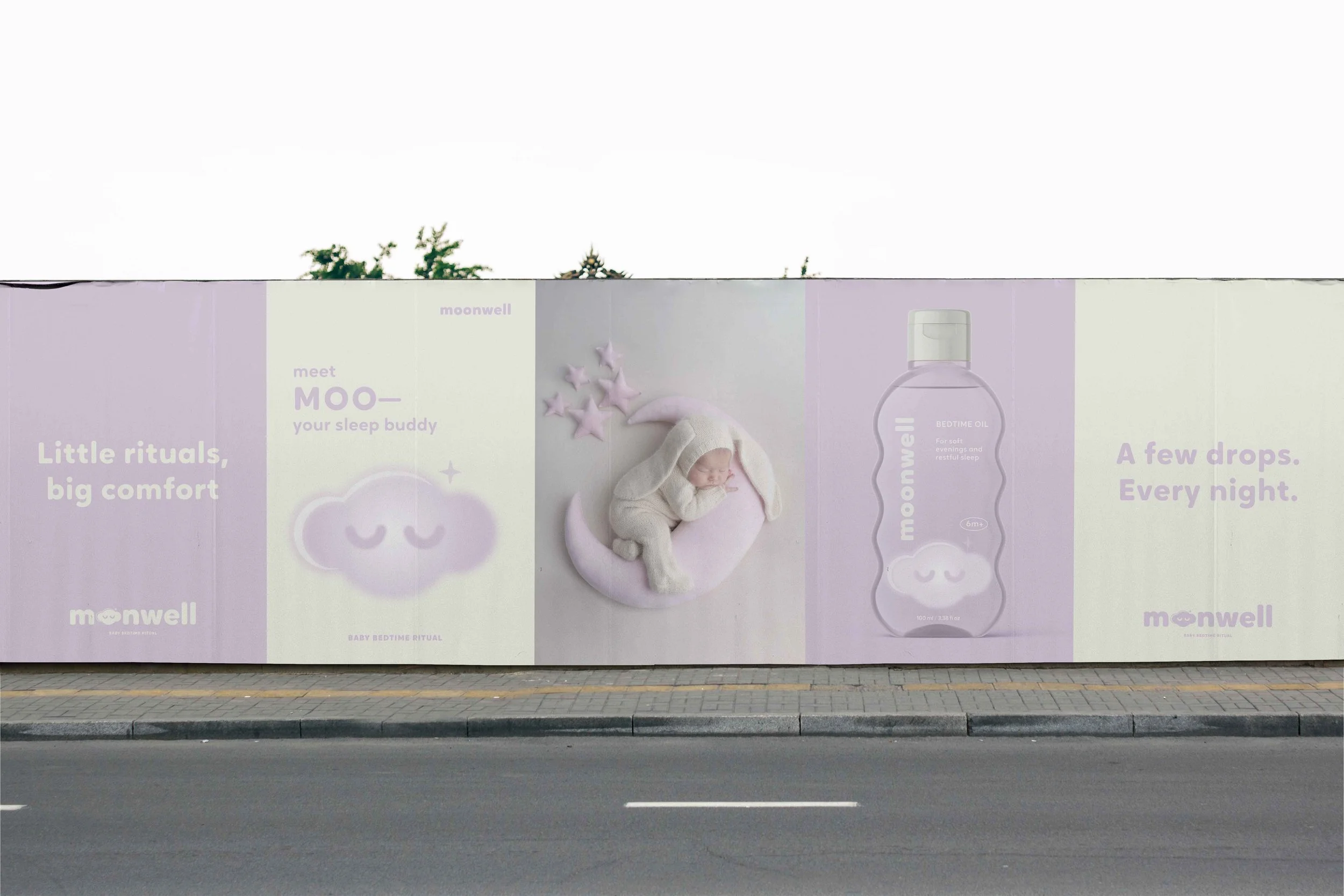


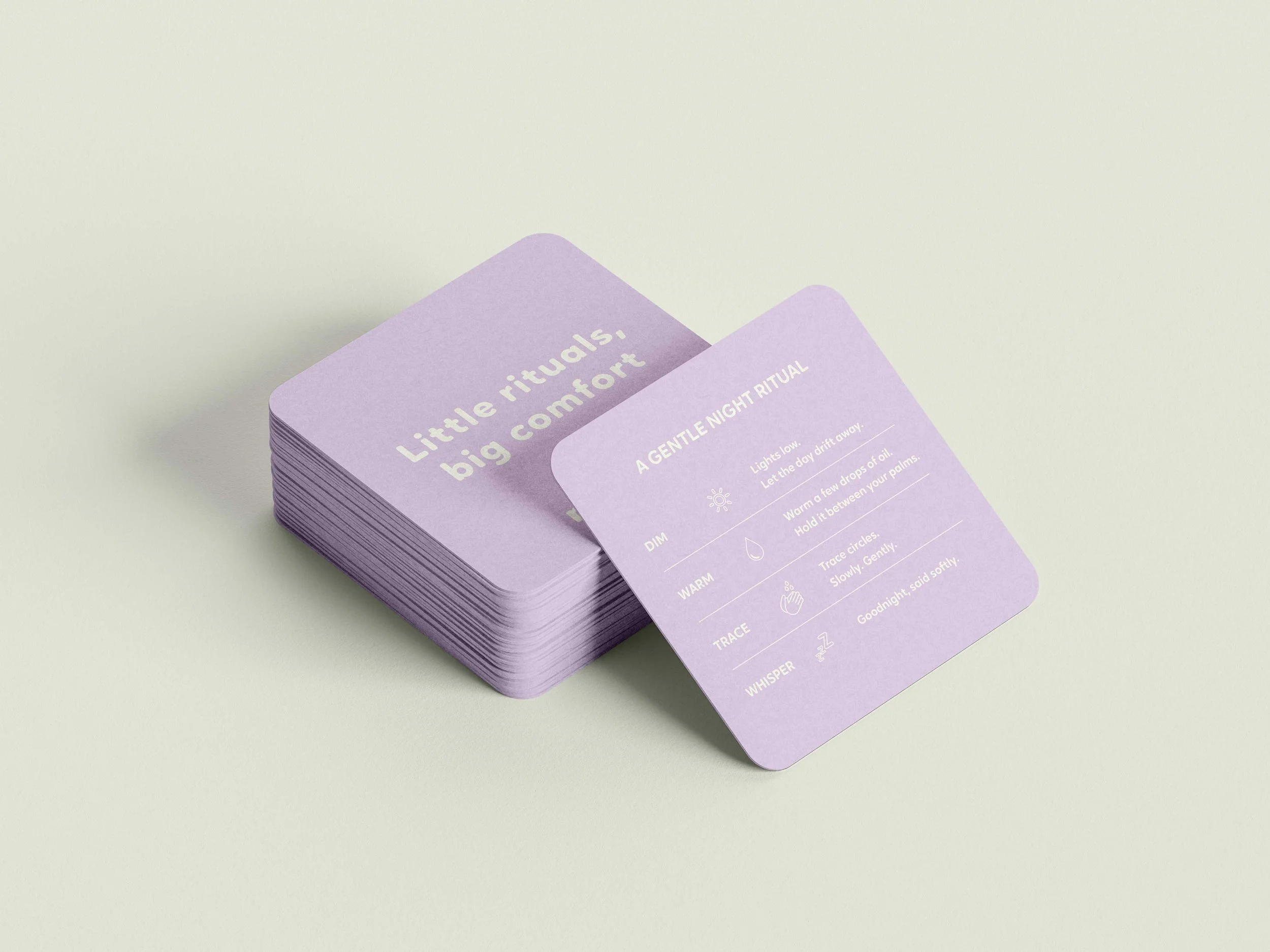
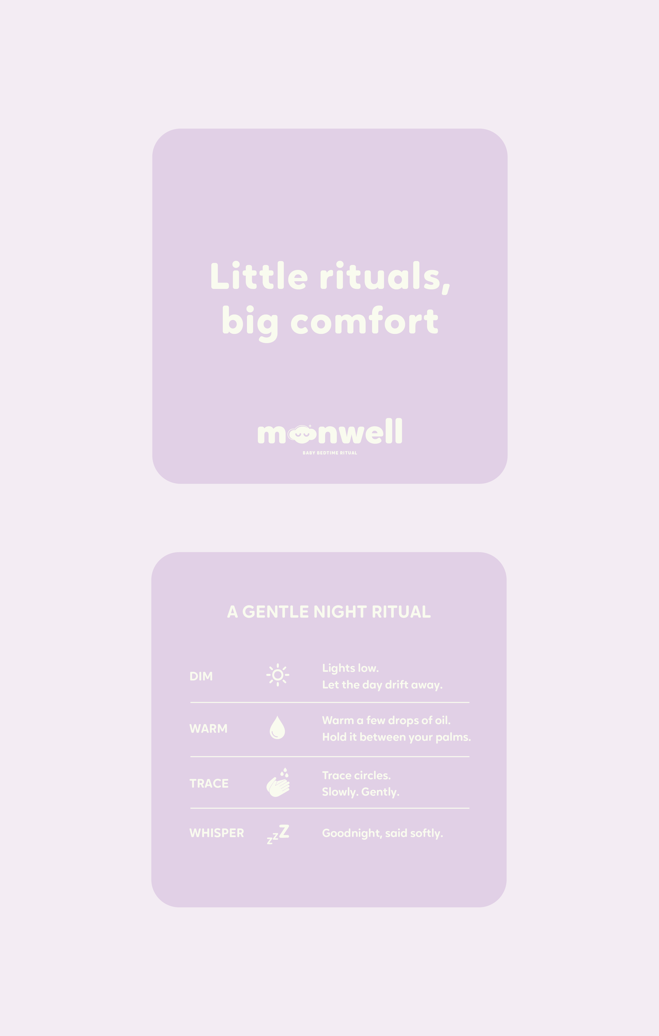
The brand extends into guided rituals, using gentle prompts and simple steps to support calm and familiar bedtime routines.

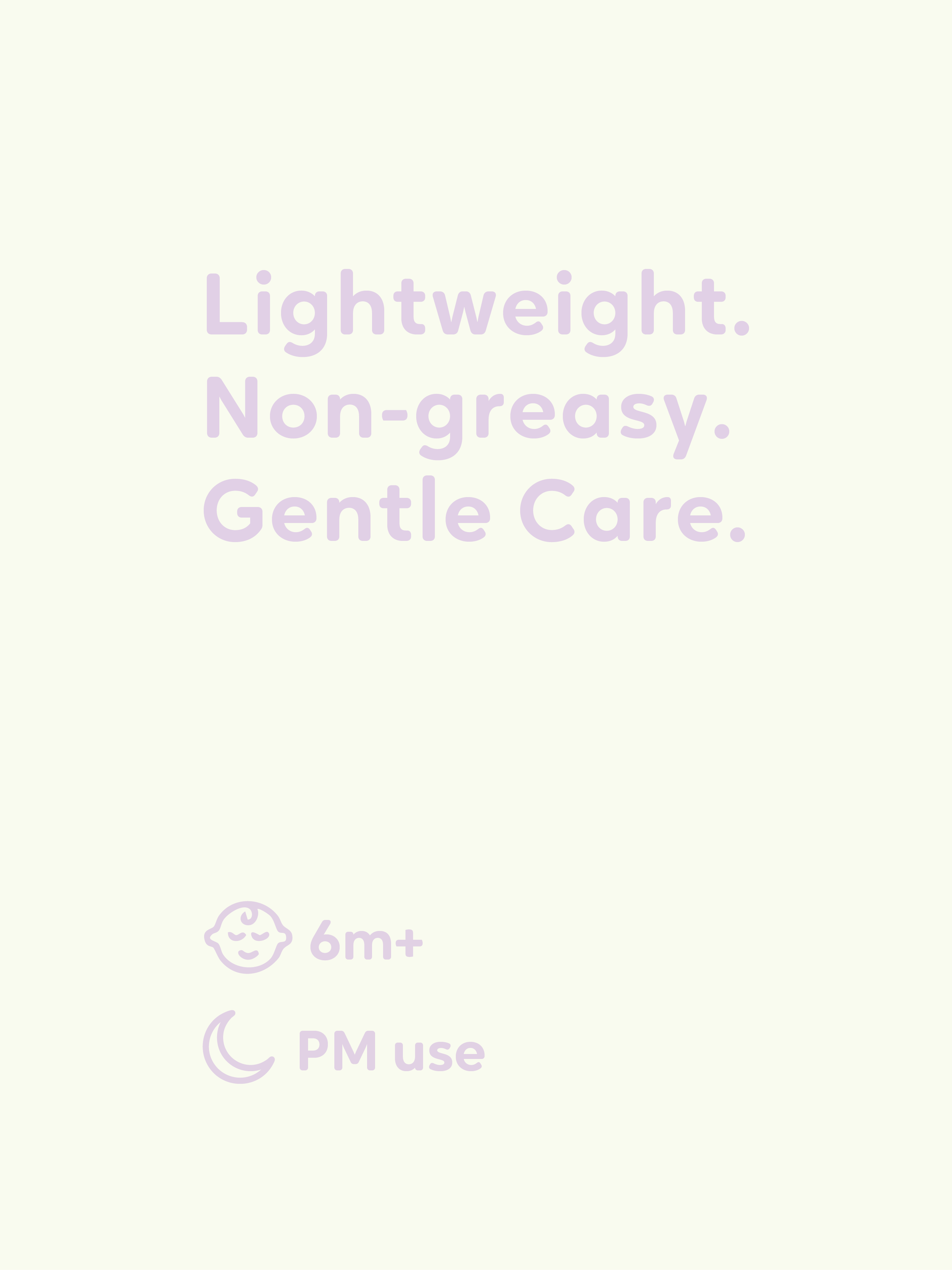
A restrained information hierarchy ensures clarity, allowing essential details to be communicated without disrupting the calm visual language.