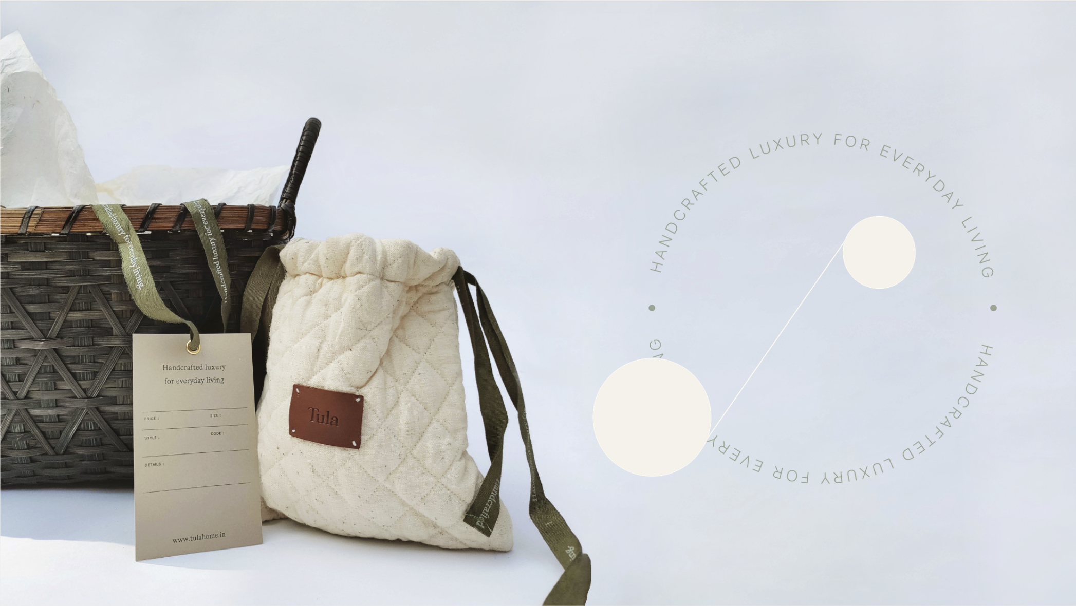

TULA
YEAR / 2022
Brand Overview:
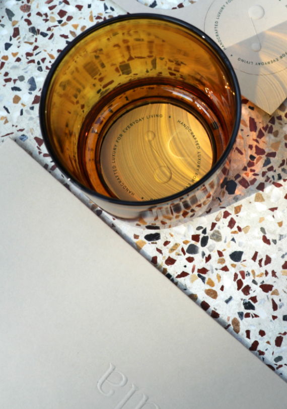
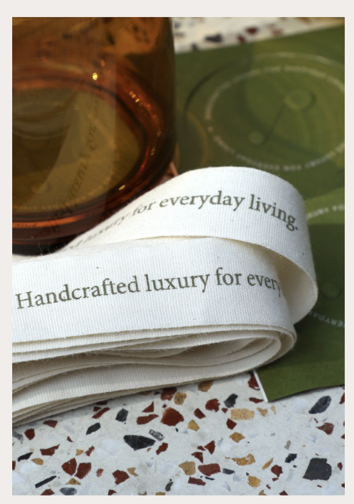
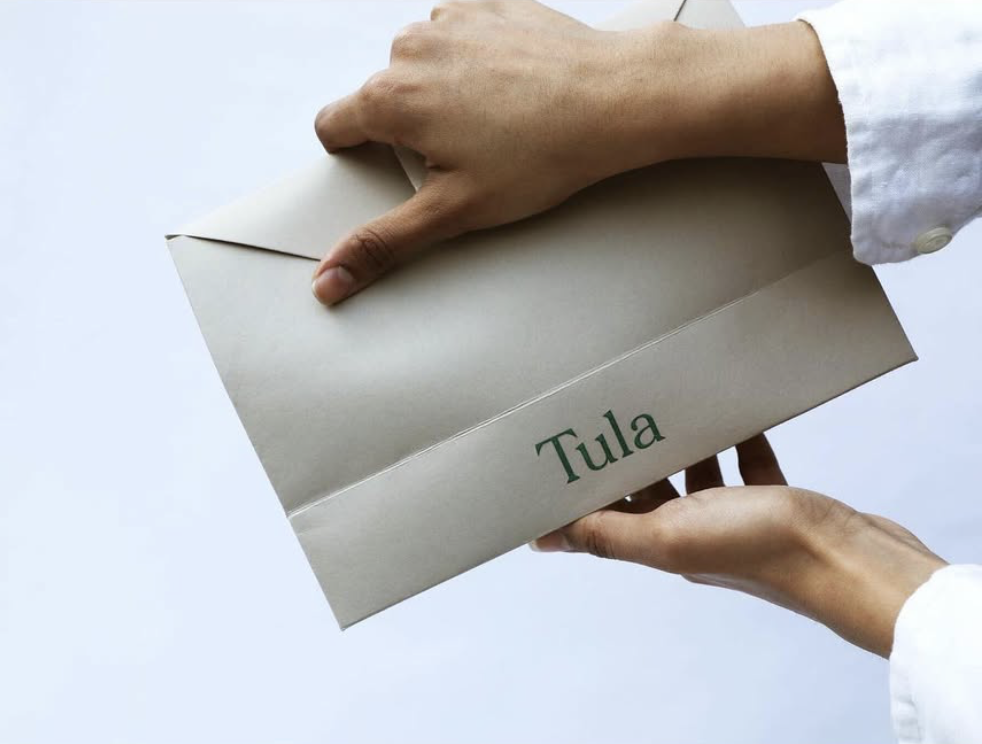
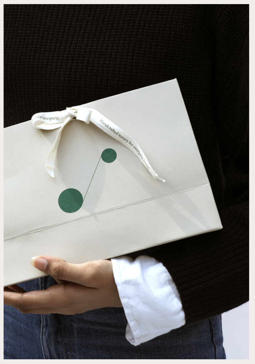
visual identity /packaging
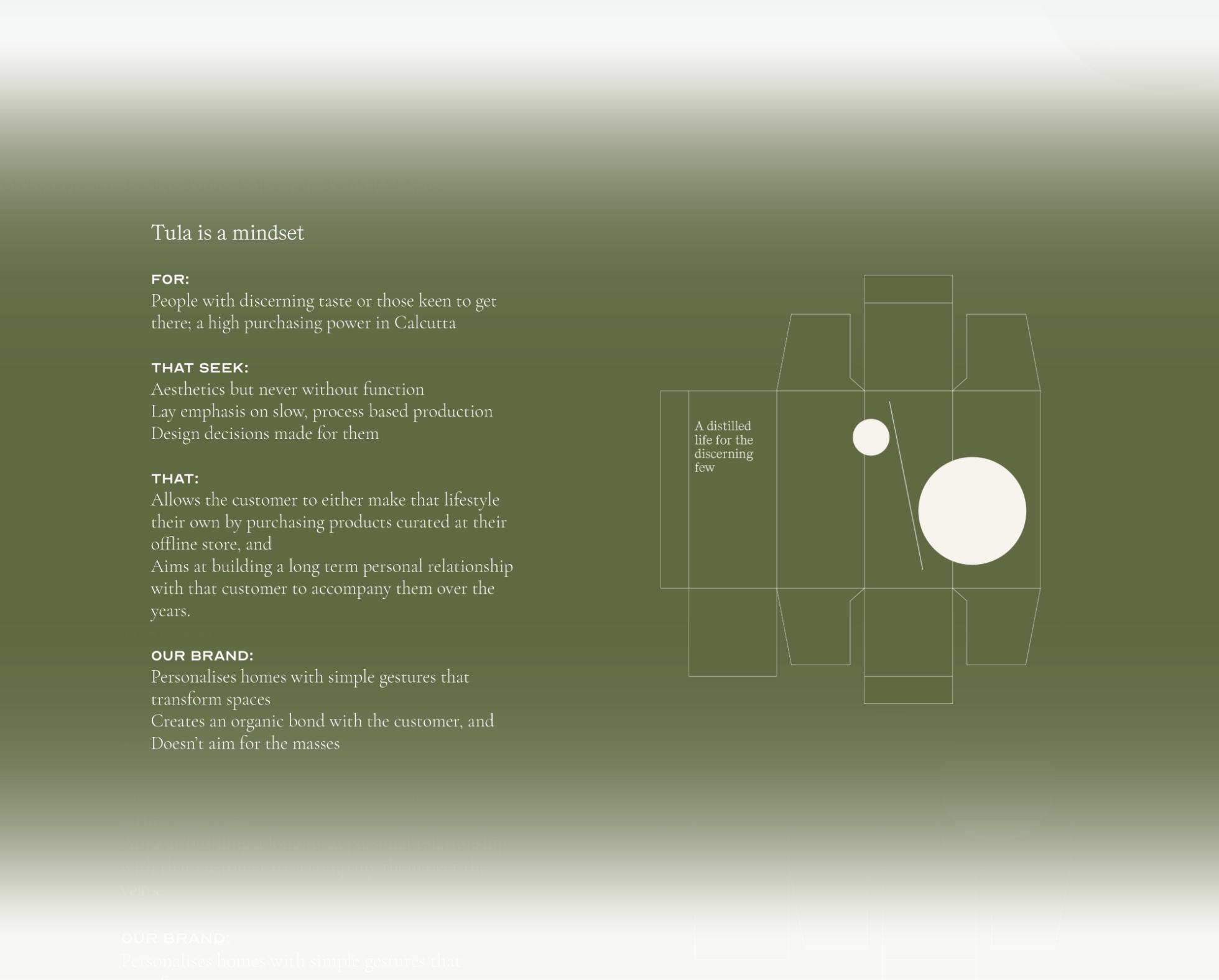
‘Tula’ means cotton in Bengali; light or precious gift in Greek, and in Hindi, the 7th sign of the zodiac, Libra — the sign of balance.
The aim was to reflect the Indian characteristics while retaining its global sensibilities — thereby building a balance or equilibrium between function and beauty; craft and design; India and the world.

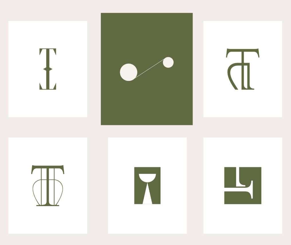
Tula’s identity was designed to reflect values that reflected a rare, simplified, contextualised and distilled way of life, anchored in the present.
The brand identity aims to reflect every aspect of the word Tula in a harmonious and unique way — the notions of balance and equilibrium, through symmetry and simple lines.
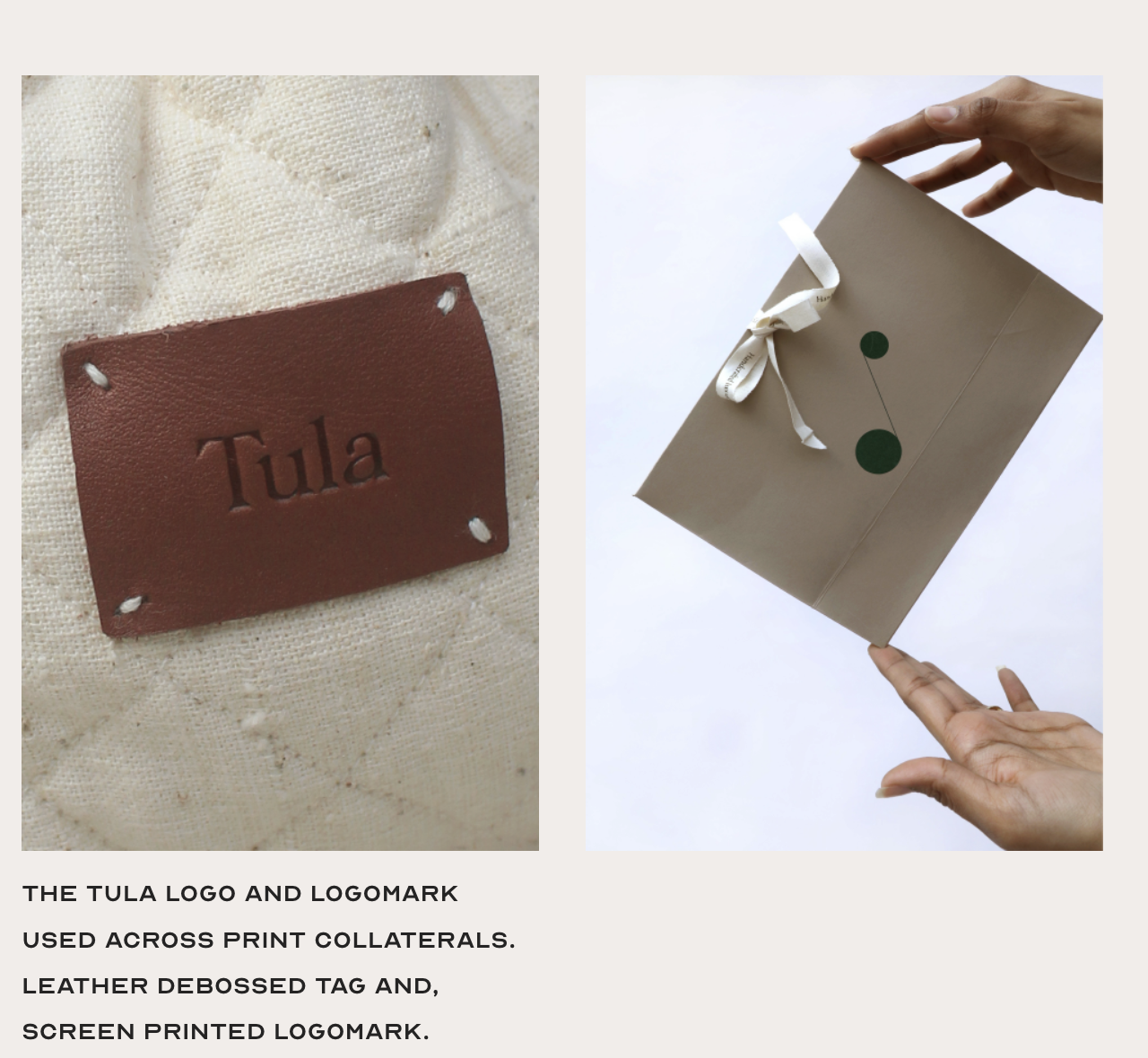
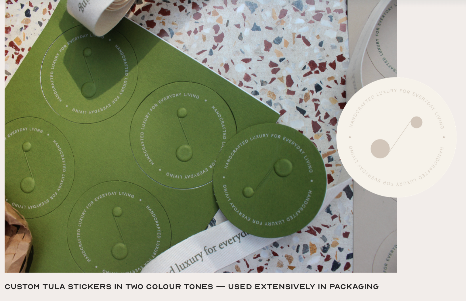
The above was, as a whole, captured in the logo mark. Two simple forms — two dots and a line, coming together to showcase the sense of balance.
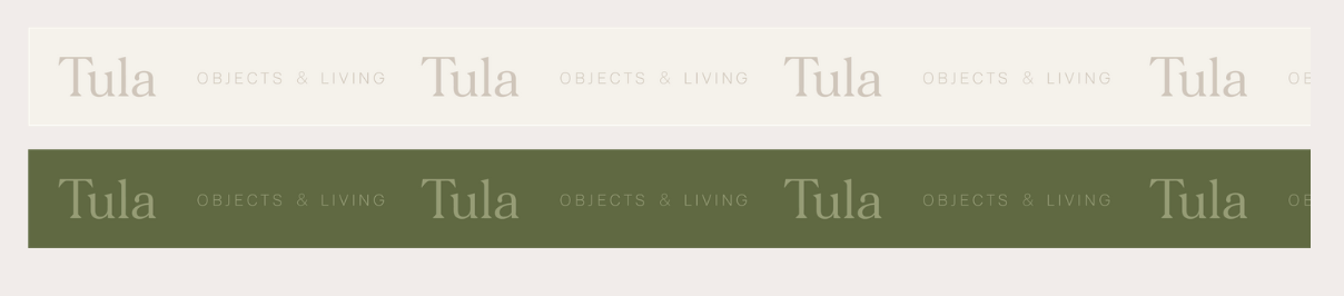
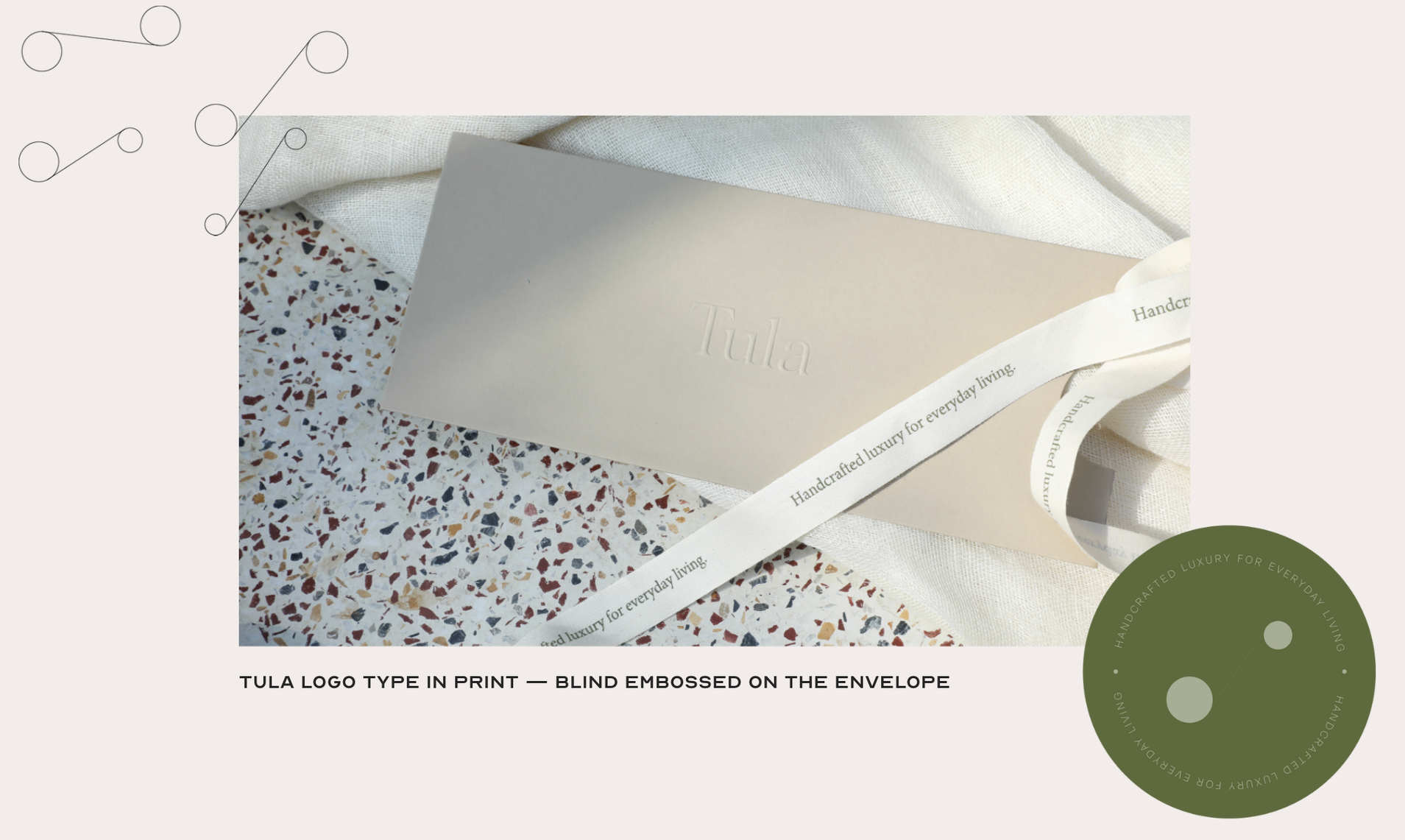
The Tula logotype was developed using Kalice, paired with RM Neue.

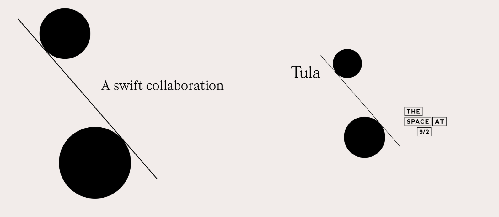
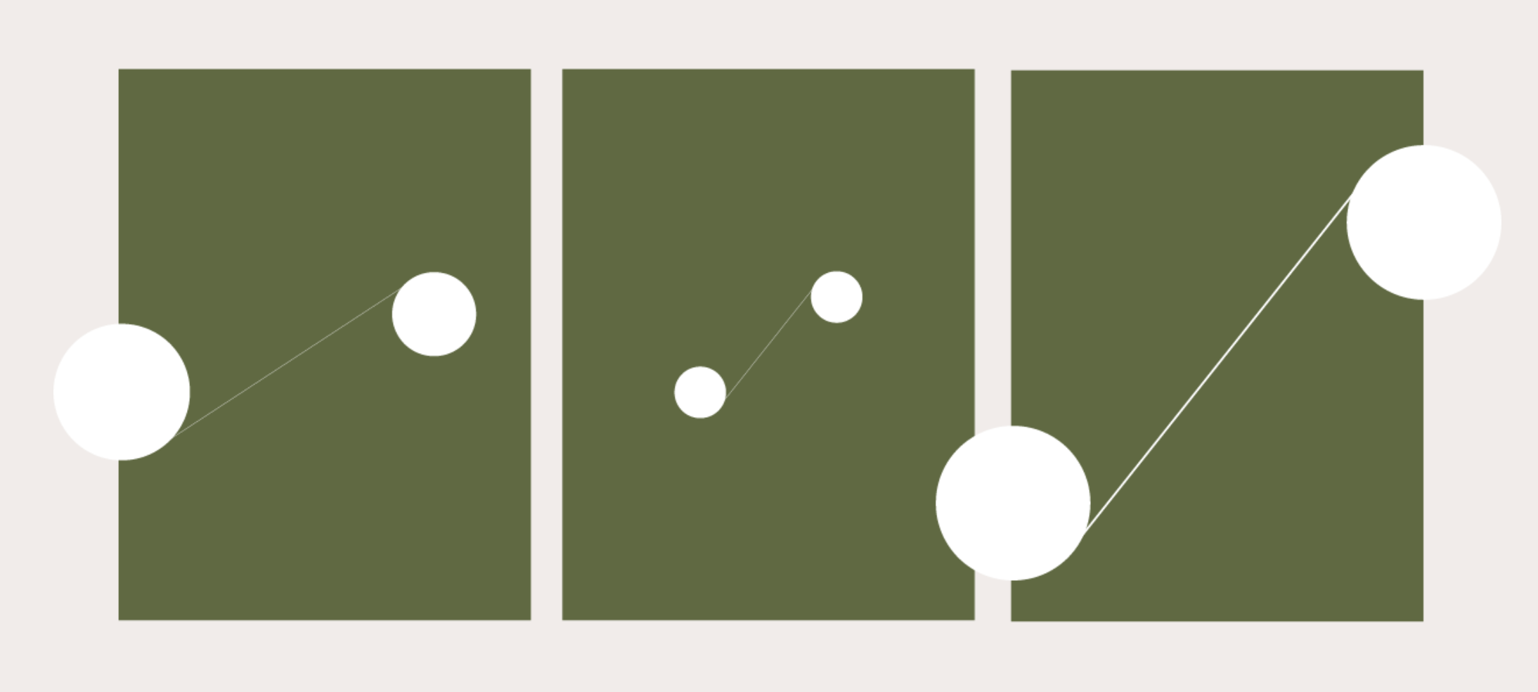
The logomark equation of two lines and a dot was then manoeuvred to showcase possible brand collaborations
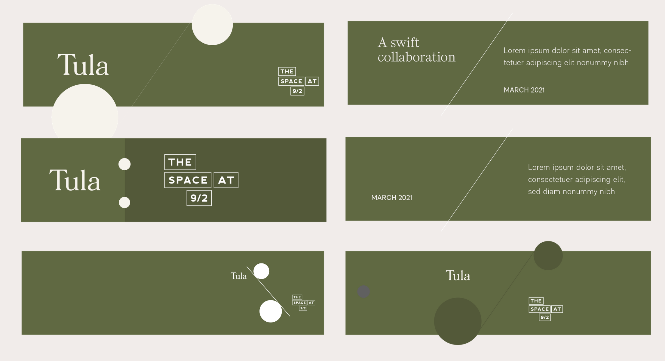

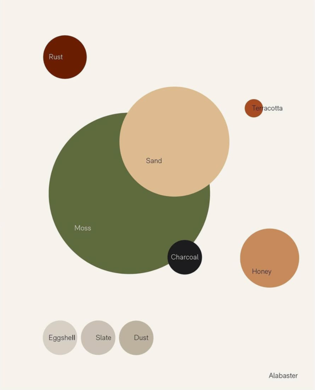
Colour Study for Tula