
BENNY & JOON
YEAR / 2024
Brand Overview:
visual identity /packaging /brand collaterals
“Some cultures are defined by their relationship to cheese” — Benny & Joon 1993
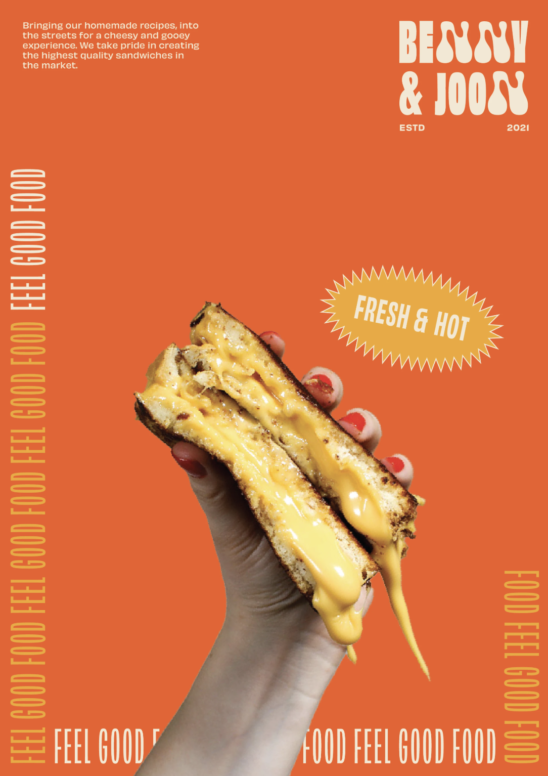
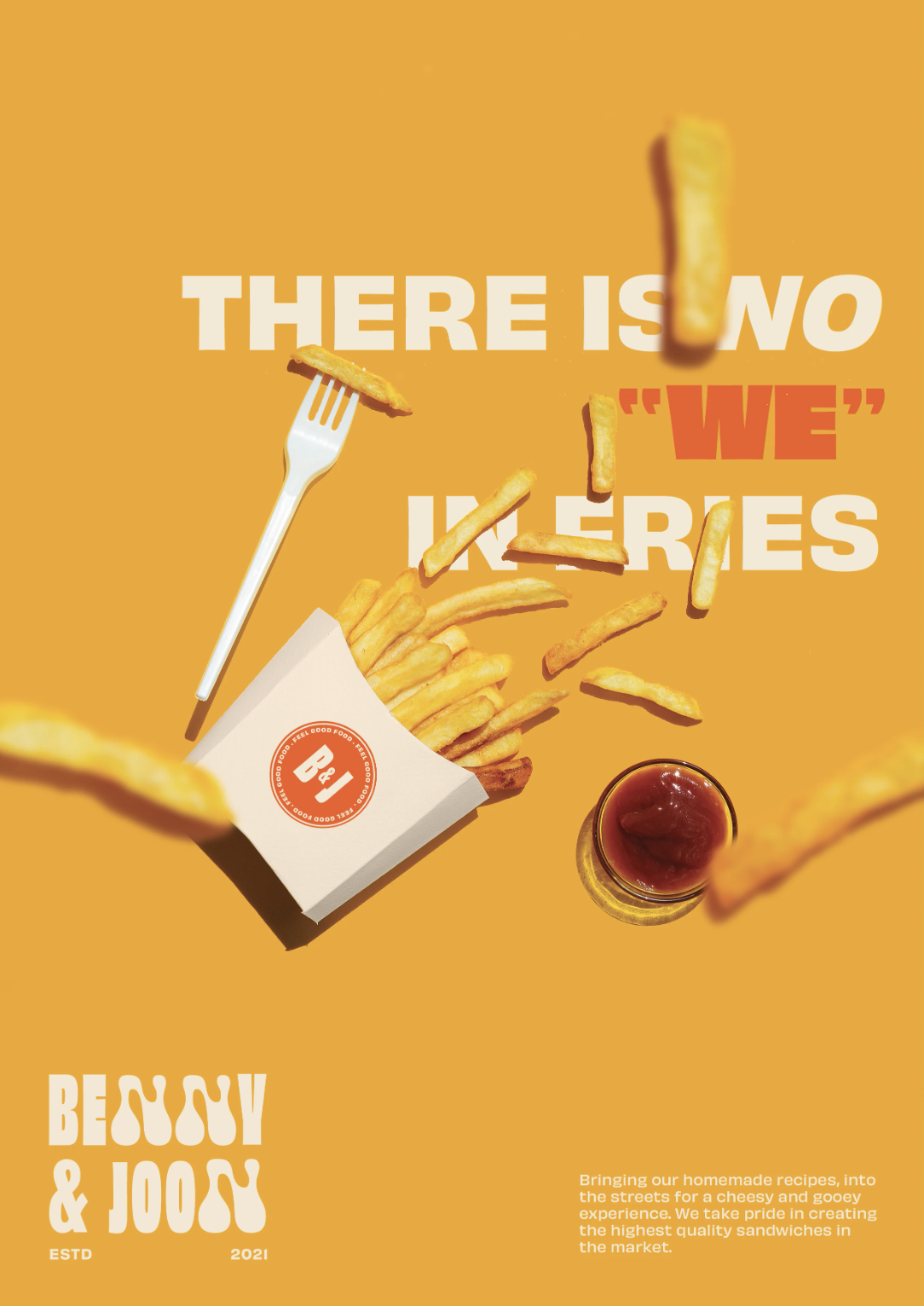
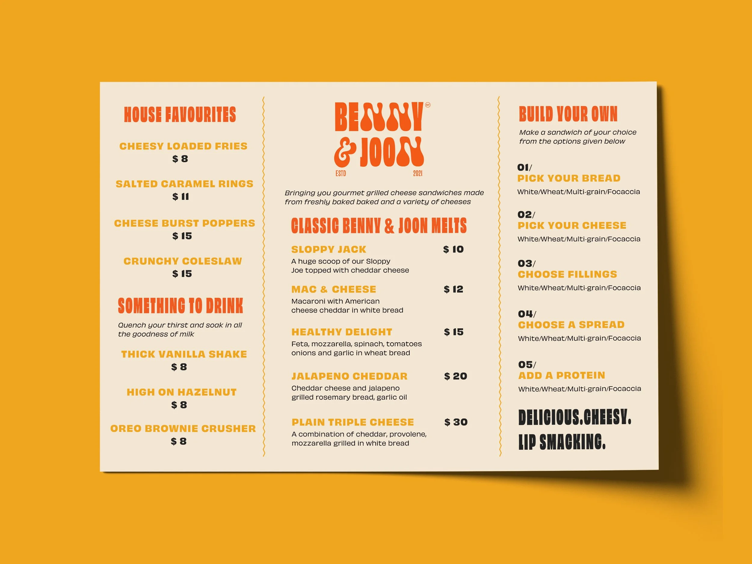
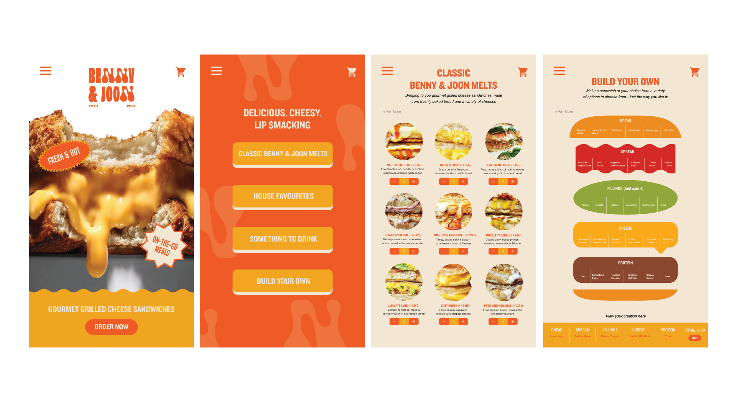
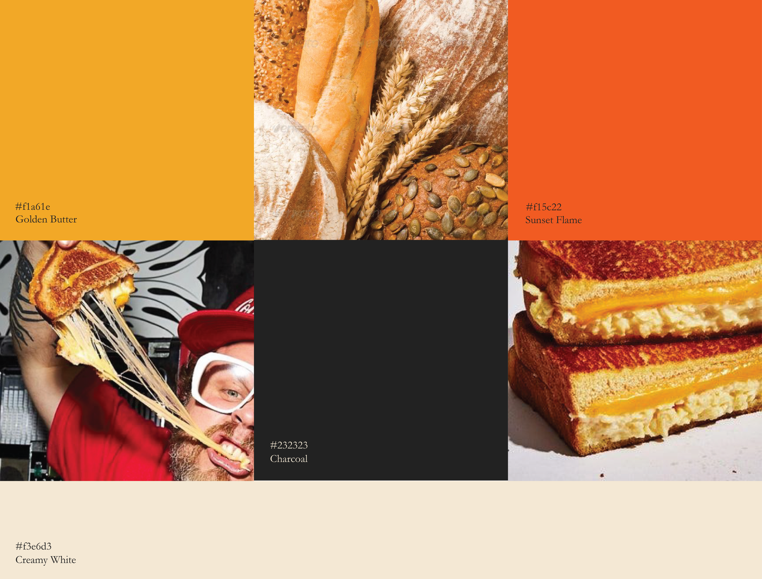
A gourmet grilled cheese sandwich brand inspired by the comfort and culture of cheese. The brand focuses on creating a rich, indulgent experience through high-quality ingredients and playful storytelling.
The visual identity explores this idea of indulgence and familiarity, translating it into a warm, expressive system across packaging and brand touchpoints.
Bold, quirky typefaces bring out the brand’s warm and playful personality, echoing the indulgent, comforting nature of the product.
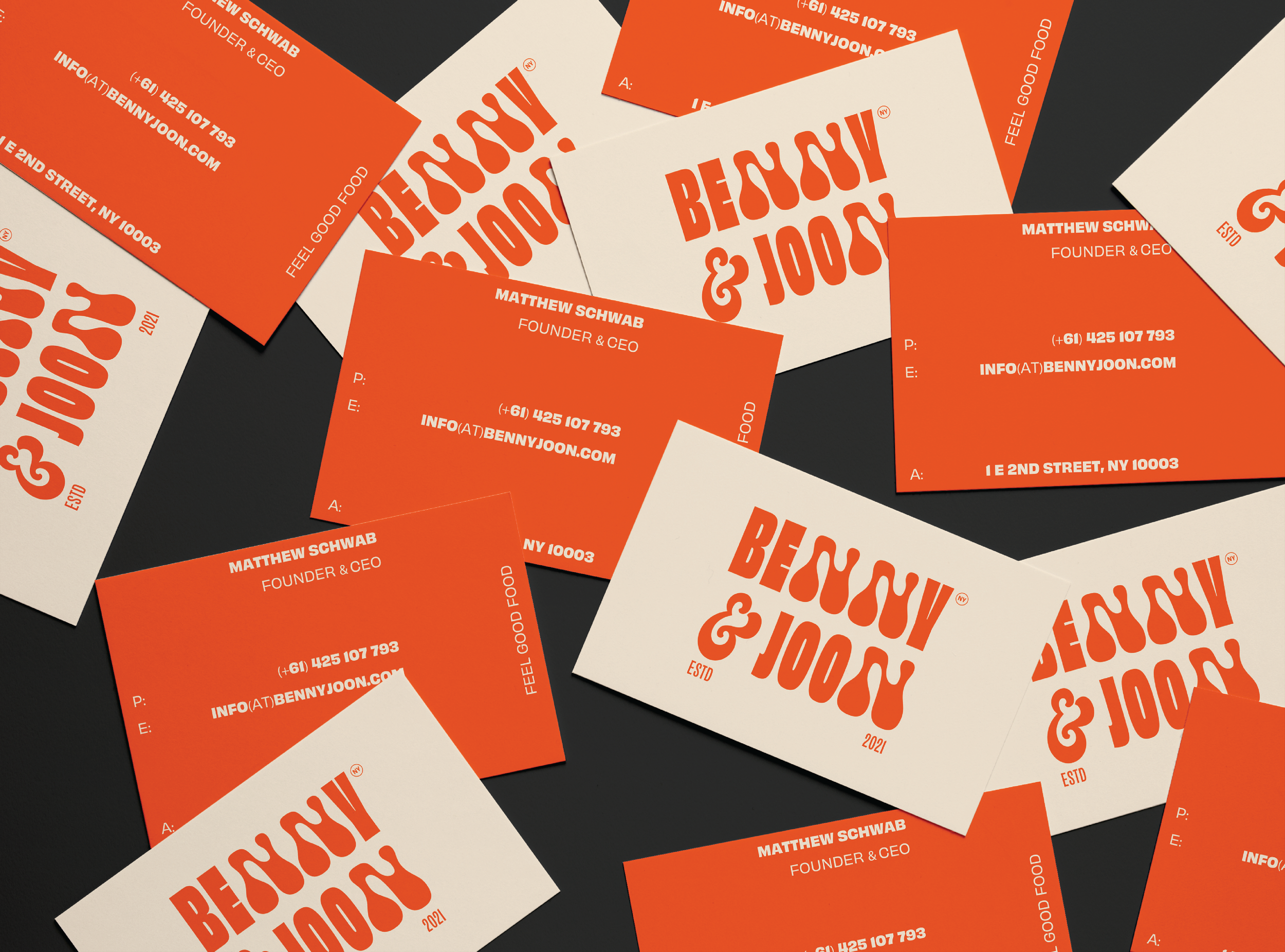
Typography: Obviously Family — OH no Type Company
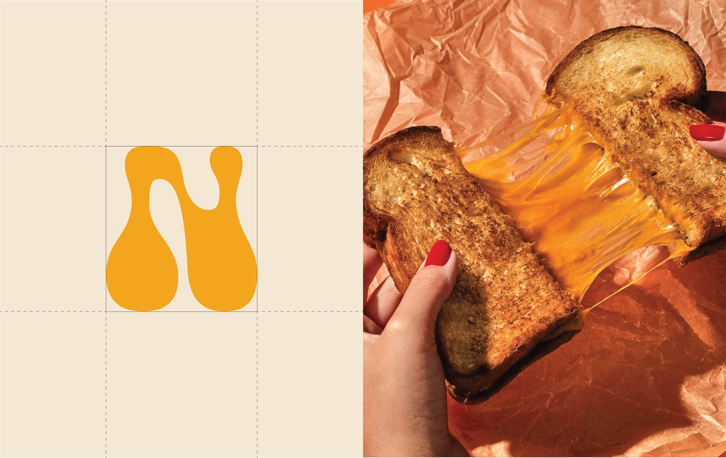
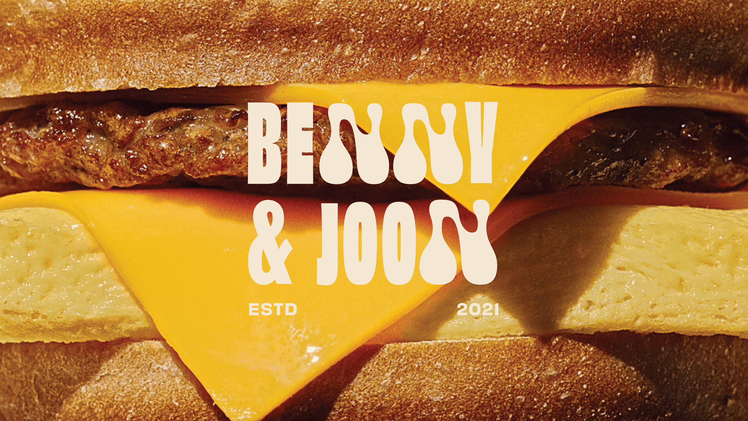
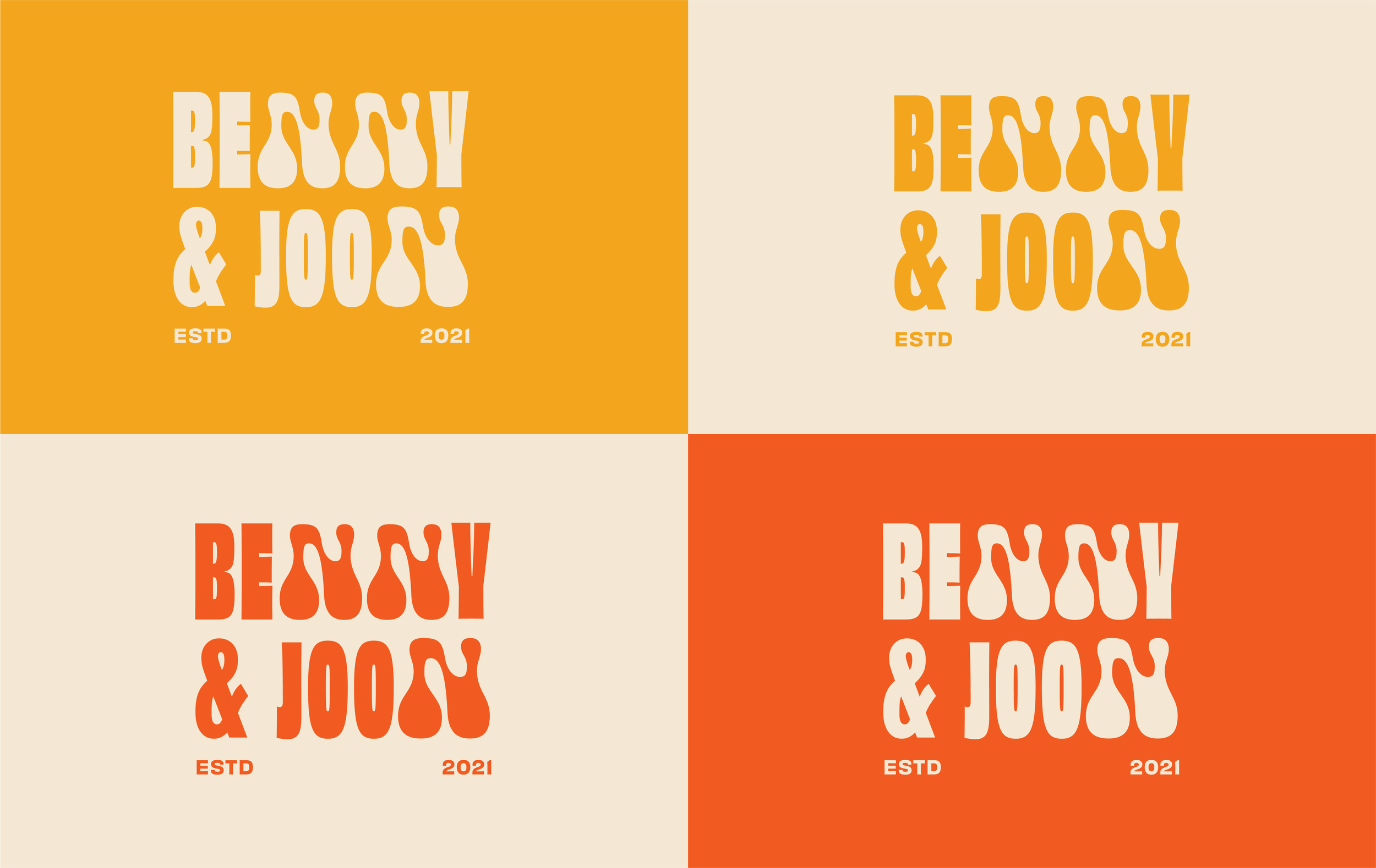
Inspired by the behaviour of melted cheese, the letter “N” becomes a playful element within the word mark while also functioning as a standalone brand asset.
Extended, tapering forms subtly reference the stretch and pull of cheese.


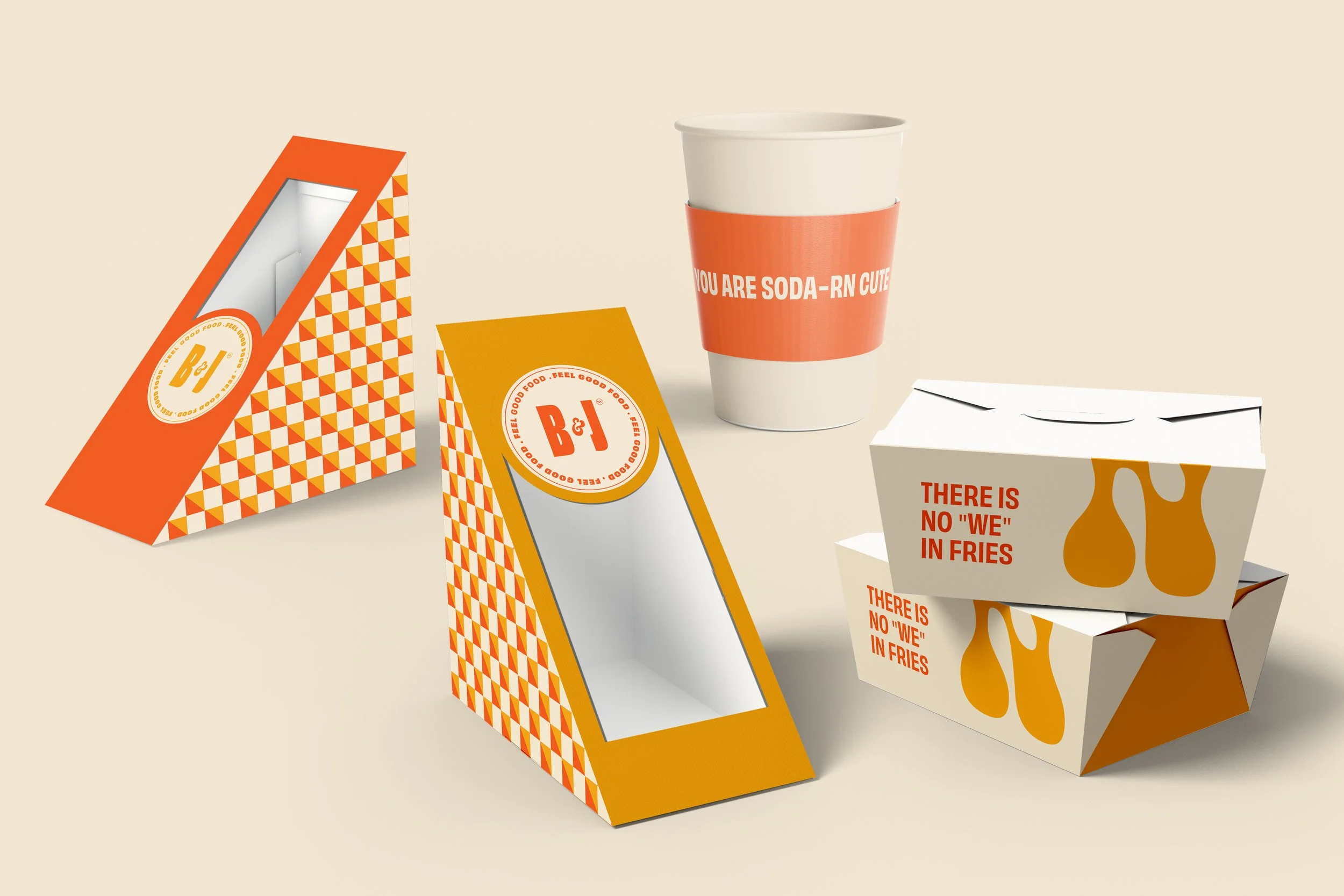
An experimental set of abstract patterns derived from the form of a sandwich, explored across varying scales, colours, and compositions. These patterns extend across packaging and brand collaterals, creating a versatile and expressive visual system.